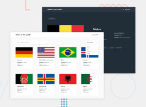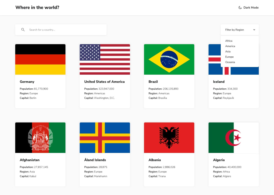
Design comparison
Community feedback
- @skyv26Posted almost 3 years ago
Hi! Jaya, very well done, really impressive work, I like to look at other's solution , in order to learn more, suddenly I saw your work. Even it is functional as its required. I have some suggestion for you.
-
You need to add some margin bottom to the main body, you can check at the end or at the page bottom, there is some white space which makes your design little bit odd.
-
your search icon is not aligned properly, so just replace your below code
.input-container .search .icon {
    color: #d3d3d3;
    left: 5%;
    position: absolute;
    top: 35%;
}
with this next one
.input-container .search .icon {
    color: #d3d3d3;
    left: 5%;
    position: absolute;
    top: 50%;
   transform: translate(-5%, -50%);
}
It will perfectly aligned your icon in center position with respect to input text field.
- I saw in mobile view your cards have random width and height and I don't know why but you have to look at your work.
I hope you understand and might be above suggestions will help you.
Good Luck
0@nobel10122025Posted almost 3 years ago@skyv26 Thank you for your feedback sir. Definitely, I will look into it and make the changes . Yes sir I was a bit confused with the search icon . Thanks again .
0 -
Please log in to post a comment
Log in with GitHubJoin our Discord community
Join thousands of Frontend Mentor community members taking the challenges, sharing resources, helping each other, and chatting about all things front-end!
Join our Discord
