Submitted about 3 years ago
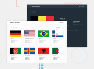
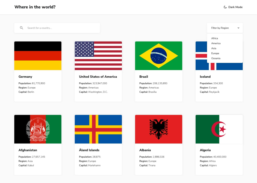
Countries page using React, Next.js , Typescript, and Tailwind CSS
@asim-ali5514
Design comparison
SolutionDesign
Solution retrospective
Please leave any feedback on how I can make the site better
Community feedback
- Account deleted
- I think padding is one crucial thing, when you resize you completely lose it and everything is on the edge of screen.
- On light mode it's like the cards have no background probably because they don't have the box shadow, and some other things need a bit more of styling... other than that I think it looks ok.
Marked as helpful0@asim-ali5514Posted about 3 years ago@thulanigamtee Thanks for pointing those things out, I'll try to fix them as quick as possible
0
Please log in to post a comment
Log in with GitHubJoin our Discord community
Join thousands of Frontend Mentor community members taking the challenges, sharing resources, helping each other, and chatting about all things front-end!
Join our Discord
