Design comparison
SolutionDesign
Community feedback
- @BettoRaitePosted about 2 months ago
Very good work! Impressive.
Things I liked:
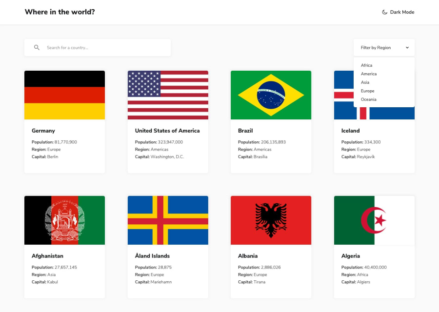
- Cards appear so smoothly, amazing fade-in and out effects.
- The animation of filter menu is just insane! (tho, I'd probably lower the delay a bit)
Things I did not like:
- The only think I would like to note is the font size of the website title on mobile, it seems a bit too small.
Further growth: Try to go beyond and add your own stuff. Show off your talent.
List of features that you could add:
Level 1- When you type country names, it would be nice if relevant parts(to search query) in country name would be highlighted.
- Pick better font.
- Add a simple landing page.
- Play a bit with colors, try to find a stunning color pallete that matches website idea.
- Improve cards, make them more attention catching.
Level 2- Try adding auth(maybe pick firebase).
- Let users to 'like' their country or any other.
- Let users add comments.
These are just some of ideas that I could come up with, I'm sure you can do it better than me!
Marked as helpful1
Please log in to post a comment
Log in with GitHubJoin our Discord community
Join thousands of Frontend Mentor community members taking the challenges, sharing resources, helping each other, and chatting about all things front-end!
Join our Discord
