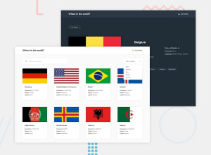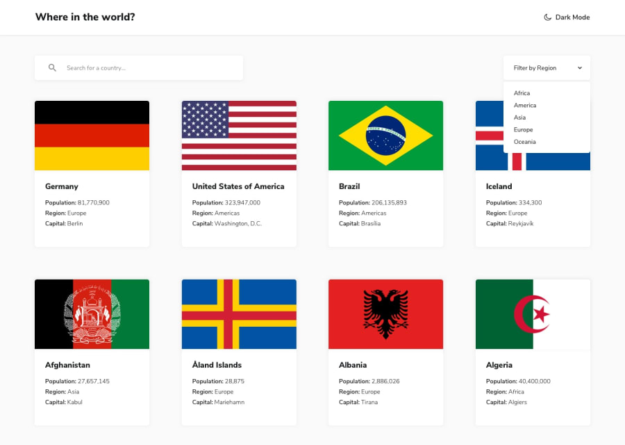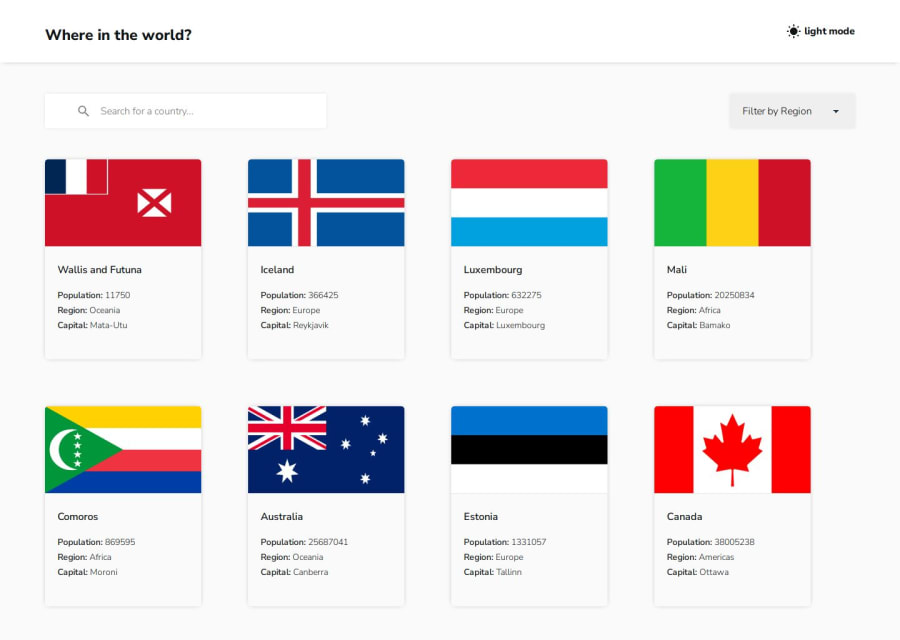
Design comparison
Solution retrospective
WHAT I AM PROUD OF:
- Writing and Deploying my first React App Project from ground up
WHAT I WOULD DO DIFFERENTLY
- Rendering list on page using paginations for better performance
CHALLENGE
- Responsiveness with details page.
SOLUTION
- I was able to solve it with flex and media query
Areas I need help with
- Rendering list with pagination
- Avoiding horizontal scroll-bar
Community feedback
- @lyes-merselPosted 5 months ago
Hey there! 👋
Thank you for updating the GitHub repository visibility. I had a chance to look at your code, and I must say, it's impressive! Your code is well-written, easy to understand, and well-structured. I appreciate your use of semantic HTML tags, which is fantastic for accessibility and maintainability. 🌟
Here are a few more tips to help you refine your project further:
1.Component Structure: One suggestion is to break your code into smaller, reusable components. The beauty of React lies in its component-based architecture. Each component should ideally be responsible for one specific task. This not only makes your code more modular and easier to manage but also enhances reusability across your project.
2.Single Responsibility Principle: Avoid overloading components with too many responsibilities. When each component handles a single piece of functionality, it's easier to debug, test, and maintain.
3.Continued Learning: Keep exploring and experimenting with different design patterns and best practices in React. The more you practice, the more proficient you'll become in building scalable and maintainable applications.
If you found my feedback helpful, I'd appreciate it if you could mark my feedback as helpful on Frontend Mentor. This will encourage me to continue providing valuable feedback to our community. 😊
Wishing you happy coding and a fantastic journey ahead in your development endeavors! Big up and good continuation! 🌈✨
Best regards, Lyes Mersel
Marked as helpful0 - @lyes-merselPosted 5 months ago
Hey there! 👋
First off, amazing job on completing the challenge! 🎉 You’ve made great progress, and your website is already looking fantastic. Here are a few tips to help you take it even further:
1. GitHub Repository: I noticed the GitHub repository link returns a 404 error. This might be because it’s omitted or set to private. Sharing your solutions as open source helps everyone in the community learn and grow together. I was really looking forward to checking out your code! Here are some thoughts based on the live site.
2. Functionality and Responsiveness: Your website is fully functional and bug-free, which is awesome! 🌟 Here are a few suggestions to make it even better:
- Hover and Click Effects: Adding a scale effect using the transform CSS property when a card or button is hovered or clicked can make your UI more engaging. Plus, changing the cursor to a pointer adds a nice touch.
- Dark Theme Adjustments: For the dark theme, consider changing the shadows from grey to dark for a more cohesive look.
- Theme Persistence: Storing the light/dark mode preference in local storage ensures the theme doesn’t reset on page refresh, providing a better user experience. Border Radius: Increasing the border-radius values can give your design a smoother and more modern look.
- Responsiveness: Your web app's responsiveness is already great, but focusing on the finer details can make it even more polished. Remember, the little things make a big difference!
3. Pagination: Pagination is an essential feature for user-friendly navigation. Here’s a great article on how to implement pagination with React: How to Implement Pagination with ReactJS. Once you grasp the basics and the logic, check out the pagination component from the Material-UI library: Material-UI Pagination. If you prefer videos, there are plenty of tutorials on YouTube.
4. General Feedback: You’re doing an incredible job, keep up the great work! 🌟 I recently completed the same challenge and shared my solution. Feel free to check out my profile for the live website and GitHub repository. Comparing our work might provide some useful insights. I'm always open to feedback too, so let’s learn from each other! If you have any questions or need further clarification, don’t hesitate to reach out. I’m here to help!
Happy Coding! 🌈✨
Marked as helpful0@LuwatPosted 5 months agoThank you so much for your timely and insightful feedback @lyes-mersel
GitHub visibility Issues: I actually saved the project as private on GitHub, I have changed the visibility. You can now access the code and advise further.
Responsiveness and Pagination: I will make use of your suggestions and will give feedback ASAP.
Thank you so much @lyes-mersel
1
Please log in to post a comment
Log in with GitHubJoin our Discord community
Join thousands of Frontend Mentor community members taking the challenges, sharing resources, helping each other, and chatting about all things front-end!
Join our Discord