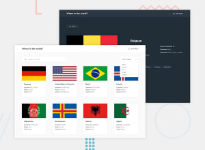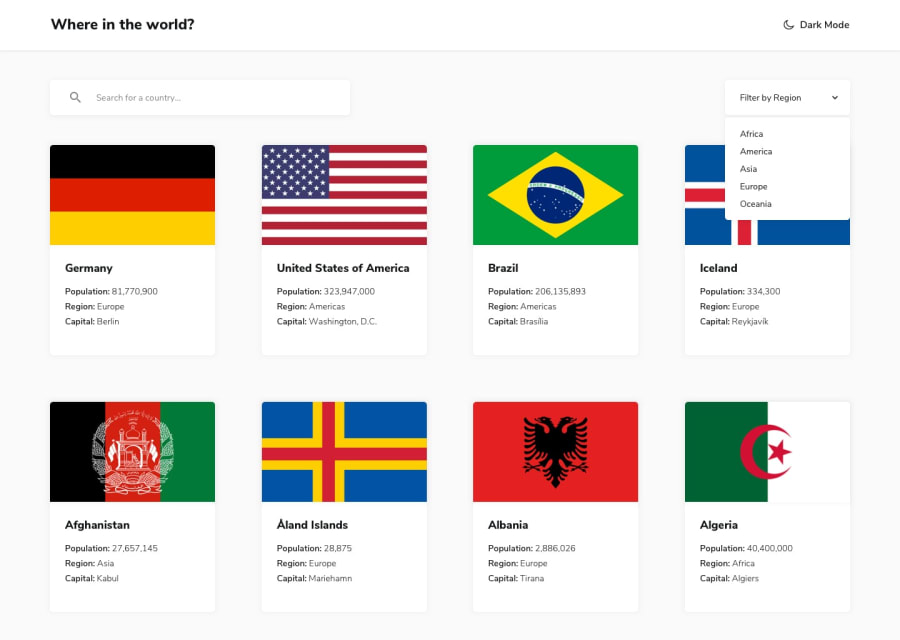
Design comparison
SolutionDesign
Community feedback
- @nxveeenPosted over 3 years ago
Awesome work!!👍 just wanted to point this out - Your countries list is floating towards the left. I noticed that you have used grid layout, so maybe add justify-content: space-around / space-between to your countries-list class. That is how I did it.😊
Marked as helpful1
Please log in to post a comment
Log in with GitHubJoin our Discord community
Join thousands of Frontend Mentor community members taking the challenges, sharing resources, helping each other, and chatting about all things front-end!
Join our Discord
