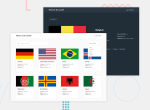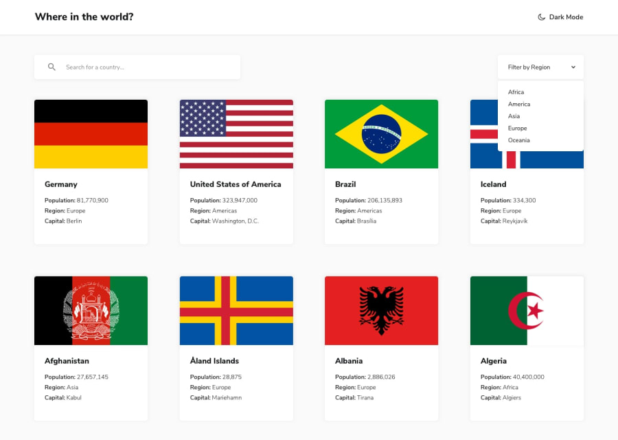
Design comparison
SolutionDesign
Solution retrospective
Hi guys, Please check my solution for this challenge and give me any feedback.
Happy Coding 🔥
Community feedback
- @tedikoPosted over 3 years ago
Hello, Han! 👋
Well done on this challenge! Your solution responds well. Here's my suggestions:
- Read about semantic. Semantic elements lead to more consistent code, they are easier to read and improve accessibility.
- You should use <h1-h6> heading tag in
.header__headingand.card__headinginstead of paragraphs. - Since your
.header__theme-switchtriggers some action from Javascript use<button>element instead of div.
Good luck with that, have fun coding! 💪
1@iwaskoreanPosted over 3 years ago@tediko Hello, tediko! 👋
I really appreciate your suggestions. I know what semantic elements are but I always use
divelement 😂. I should use them.Thanks again, mate.
0
Please log in to post a comment
Log in with GitHubJoin our Discord community
Join thousands of Frontend Mentor community members taking the challenges, sharing resources, helping each other, and chatting about all things front-end!
Join our Discord
