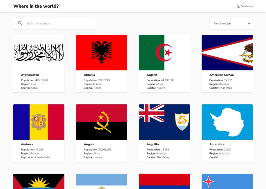
Countries App using Next.js 14
Design comparison
Solution retrospective
Hello, community!
I thought this challenge is perfect to implement with Next.js, since the list of countries is not something to change often. You can take full advantage of Next.js' static site generation.
Please give your feedback on semantic HTML usage, CSS cleanliness and any other areas that you feel can be improved!
Some highlights from the project that might be interesting for you:
- The theme toggler that is initially set to user's prefference and doesn't cause a flicker on page load.
- Zero layout shifts - Usage of Next.js' features like font, Image for obtaining this result. Usage of
object-fitproperty on the image according to my needs (image in the card or image in the country details page) - Generate dynamic metadata - Use Next.js' generateMetadata function that receives params from generateStaticParams to customize metadata of each page. So the title of the tab is the country name and the icon is the country flag on Country Details Page.
I only played a little bit with animating the Back button and it was loads of fun! I would like to add more animations to make the app feel more friendly. The problem is that I'm not very good at coming up with ideas on my own. So if anybody's reading who is interested in UI/UX and wants the challenge of upgrading the designs to a more modern version, I will gladly implement it!
Community feedback
Please log in to post a comment
Log in with GitHubJoin our Discord community
Join thousands of Frontend Mentor community members taking the challenges, sharing resources, helping each other, and chatting about all things front-end!
Join our Discord
