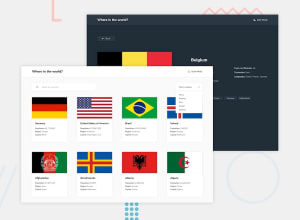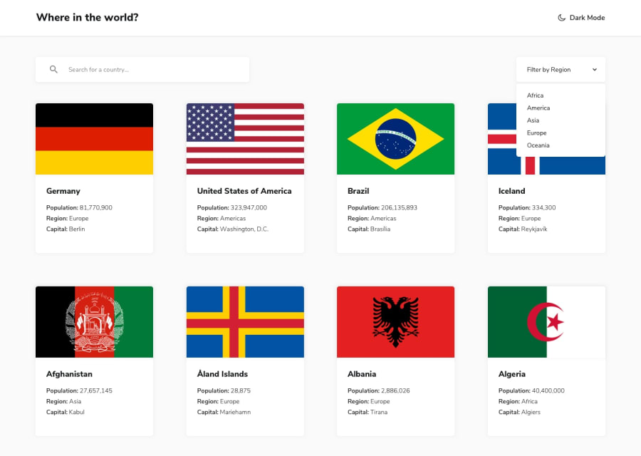
Design comparison
SolutionDesign
Community feedback
- @DarkFMPosted about 4 years ago
Angular doesn't get a lot of love so its glad to see one in the wild :) I like the solution so far. There are some things i noticed though:
- The content does not shrink at smaller screen sizes, and overflows the view-port. You can use media queries to solve this.
- The country cards are don't have any indication that they are clickable. You can use a
cursor: pointerin the CSS. Its good for user experience.
0
Please log in to post a comment
Log in with GitHubJoin our Discord community
Join thousands of Frontend Mentor community members taking the challenges, sharing resources, helping each other, and chatting about all things front-end!
Join our Discord
