Countries app
Design comparison
Community feedback
- @mrprogrammer1-2Posted 5 months ago
that looks awesome you gave me courage to try and do this challenge
Marked as helpful0 - @Mahmoud-ElagamyPosted 5 months ago
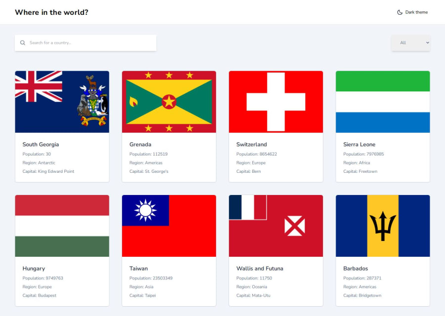
Hey, great work on the project! The design is clean, and the functionality is coming together nicely. I have a few suggestions that could help improve the user experience:
- Current Theme Text: I noticed is that the theme text always displays ‘Dark Theme’ regardless of the current state. It might improve the user experience if the text updates to reflect the active theme (e.g., ‘Light Theme’ when in dark mode).
- No Search Results Handling: When searching for a country while the active region filter is set to a different continent (e.g., searching ‘Kenya’ while the region is set to Asia), I noticed that a blank page is displayed. Adding a message like ‘No countries found’ would be helpful to guide users.
- Container Usage for Layout Control: I noticed that when zooming out, the content stretches beyond the viewport, making it difficult to read. Implementing a max-width container could help maintain a consistent and readable layout.
These tweaks could make your app even more user-friendly. Great work so far!
Marked as helpful0@DadciPosted 5 months ago@Mahmoud-Elagamy Thanks you much Mahmoud, I already worked on the search and filter 🙏
0
Please log in to post a comment
Log in with GitHubJoin our Discord community
Join thousands of Frontend Mentor community members taking the challenges, sharing resources, helping each other, and chatting about all things front-end!
Join our Discord
