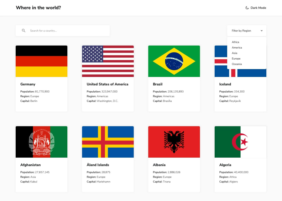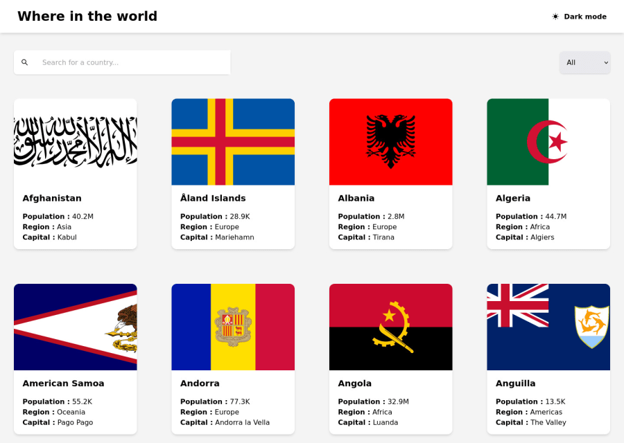
Design comparison
SolutionDesign
Solution retrospective
Here is my solution for this challenge with Next.js and tailwind !
Community feedback
- @shashreesamuelPosted over 2 years ago
Hey good job completing this challenge. Keep up the good work
Your solution looks great however I think that the box shadow on the title bar is supposed to be subtle.
In terms of your accessibility issues
-
html element must have a lang tag like this
<html lang='en' -
Wrap all your content between
maintags
In terms of validation errors simply I hope this helps
Cheers Happy coding 👍
0 -
Please log in to post a comment
Log in with GitHubJoin our Discord community
Join thousands of Frontend Mentor community members taking the challenges, sharing resources, helping each other, and chatting about all things front-end!
Join our Discord

