Countries API using React, React Router, React Query, RTK, TailwindCSS
Design comparison
Solution retrospective
Hosting
Community feedback
- @TedJenklerPosted 8 months ago
Hi CyberLime,
Great job on the project! It looks fantastic. I have a few suggestions for further improvements:
Animations on Cards: Consider adding animations to the cards instead of just using a shadow effect. It could add a nice extra touch to the user experience.
Custom Select Component: It might be helpful to learn how to create a custom select component. It's an essential skill for a web developer, allowing you to fully customize the select dropdown according to your design needs.
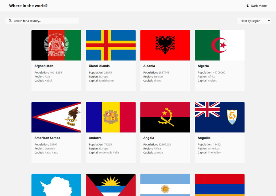
Responsive Design: Excellent use of the grid system! Your site is fully responsive, which is great to see.
Flag and Text Alignment: It looks like there's an issue with the selected flag; the flag and text are quite far apart. However, it's impressive that you've included border names instead of just abbreviations like "FRA." Not many people take that extra step.
Axios vs. Fetch: While not necessary, I recommend considering the use of Axios instead of Fetch. It can provide additional features and ease of use.
I hope you find this feedback helpful!
Best, Teodor
Marked as helpful1
Please log in to post a comment
Log in with GitHubJoin our Discord community
Join thousands of Frontend Mentor community members taking the challenges, sharing resources, helping each other, and chatting about all things front-end!
Join our Discord
