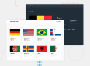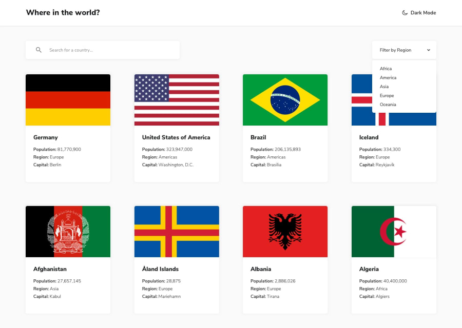
Design comparison
Solution retrospective
- A lot of Knowledge I gain
- Think More Than Code
- New Page With Each Country - ReactRouter
- Deal With API's
Community feedback
- @TedJenklerPosted 3 months ago
Hi Omar,
Nice job on the project! Here are a few suggestions for improvement:
Custom Select Enhancements: Your custom select looks great! To enhance it further, consider adding a rotate animation along with hover effects. This can make the interaction feel more dynamic.
Use useRef Hook: For a better user experience, use the useRef hook to close the menu when clicking outside of the select component. This adds a layer of usability and keeps the interface clean. (Extra Challange is to put this in a custom hook)
Check Chrome DevTools: I noticed some minor layout issues on the selected country page. It might be helpful to inspect these using Chrome DevTools to identify and fix the discrepancies.
Hope these tips are helpful!
Best, Teodor
Marked as helpful0
Please log in to post a comment
Log in with GitHubJoin our Discord community
Join thousands of Frontend Mentor community members taking the challenges, sharing resources, helping each other, and chatting about all things front-end!
Join our Discord
