Design comparison
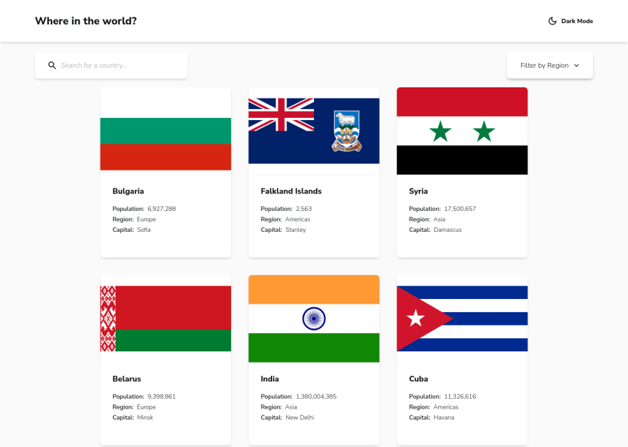
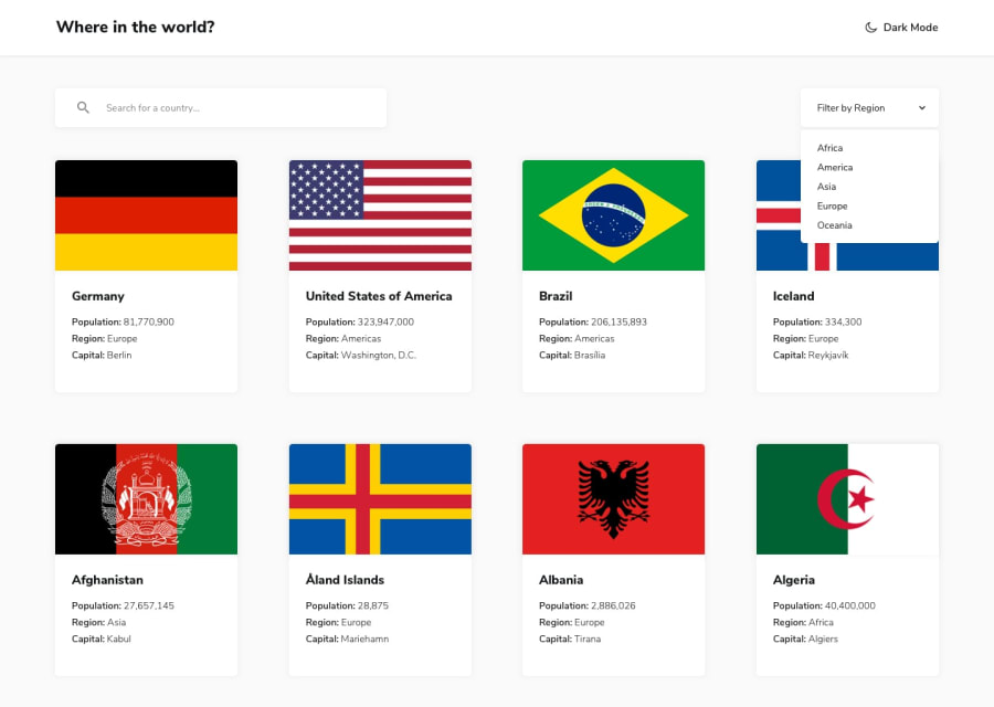
SolutionDesign
Solution retrospective
Any feedback is welcome!
Had some trouble trying to find a good one-size-fits-all dimensions for the flag image
I've added some minor additions that weren't included in the initial design:
- Skeleton loading on Main page and Details page
- Link to Google Maps for country on Details page
- Include Currency symbol in addition to Currency Name
- I assumed that clicking on any of the existing Border Countries on the Details page should direct the user to that specific Country Details page
- Input keyword and/or Region dropdown along with the filtered results persist when navigating from the Details page -> Main page via Back button
Community feedback
Please log in to post a comment
Log in with GitHubJoin our Discord community
Join thousands of Frontend Mentor community members taking the challenges, sharing resources, helping each other, and chatting about all things front-end!
Join our Discord
