Countdown Timer with flipping animation and pause/resume functions
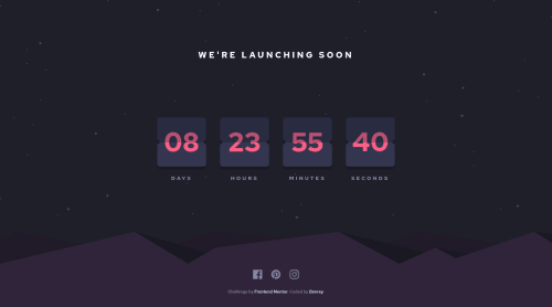
Design comparison
Solution retrospective
That was quite a tough challenge, but I think I learned quite a lot (working with setInterval(), setTimeout() in JS; adding animation via JS, etc.)!
The most difficult part was to animate the cards. I struggled for some time with css and then tortured myself with js, but eventually it worked 😅 (There's a bug where numbers kind of skew a pixel or two every time they flip. I've tried really hard to get rid of it, but the only solution was to change the width/height of the card, which worked only for the desktop design. P.S. I tried all kinds of length units, like px, rem, %, vw, etc.).
In terms of functionality, you can do the following:
- Press "Space" key to pause/resume the timer;
- Press "Enter" key to see what happens at the end of the countdown (there's some extra animation I added);
- Click social-media links to refresh the page and therefore restart the timer.
As always, any feedback is welcome!
Happy coding, everyone! 😉
Community feedback
- @BurritoDoggiePosted over 3 years ago
Hello Bonrey,
Sweet Job ! I like yours a lot, I saw a different person's solution and only the numbers moved. You made the animation were the little 'flaps' move. Also I like the animation at the end of the countdown.
Keep Coding!
(@@) \__/
2@BonreyPosted over 3 years ago@BurritoDoggie thank you! 😊 The animation was really worth it, in my opinion.
1 - @ApplePieGiraffePosted over 3 years ago
Hi, Bonrey! 👋
Amazing work on this challenge! 👏 Animating the countdown cards can definitely be tricky, but I think you've done a pretty nice job on that! 👍
I really like the extra features you added and it's great to hear you learned a lot during this challenge (I always learn new things when I complete challenges, too). 😀
Everything else looks good and is responsive. 👏
A minor suggestion might be to make sure the background image of the mountains scales to fit the entire screen on extra-large screens (currently, there's just some empty space to the left side of it). 😉
Keep coding (and happy coding, too)! 😁
2@BonreyPosted over 3 years ago@ApplePieGiraffe wow, thank you for your feedback! It's so cool to get some advice from the top user of this site 😀 I'll definitely fix that little issue with the background fitting extra-large screens.
1 - @SarahHenriettePosted over 3 years ago
Hi Bonrey !
Wow, well done for your project 😃
I did it too but I clearly did not manage to make the animations on the maps and I admit that I did not have the patience to do it either.
Well done for the features 👍
good continuation !
2@BonreyPosted over 3 years ago@SarahHenriette thank you! I'm so glad to receive the first comment from someone 😊
2 - @RomerofPosted over 3 years ago
wow!! I like your solution, crack!
0
Please log in to post a comment
Log in with GitHubJoin our Discord community
Join thousands of Frontend Mentor community members taking the challenges, sharing resources, helping each other, and chatting about all things front-end!
Join our Discord