Design comparison
SolutionDesign
Solution retrospective
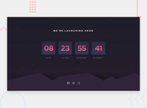
Overrall, this was an interesting challenge for me. I used vanilla JS and tailwind for the styling.
Updating the card every second was the tricky part for me. I realised I had to update the time inside the function call. Not in the global scope. That was what made the difference for me.
The line-through still looks somehow to me. I'm not sure if that's the best way to implement it.
Also, I was not able to implement the bonus part of the challenge. i.e to make the card flip from the middle every second. I'd look into it in the future definitely. I would love to hear your feedbacks 😊
Community feedback
Please log in to post a comment
Log in with GitHubJoin our Discord community
Join thousands of Frontend Mentor community members taking the challenges, sharing resources, helping each other, and chatting about all things front-end!
Join our Discord
