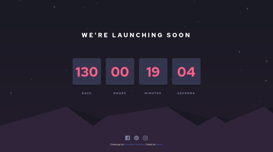
Design comparison
SolutionDesign
Solution retrospective
Unfortunately I was not able to create the flip animation, no matter how many tutorial i saw... if someone can give me some tips it's would be very appreciate :)
Community feedback
- @BonreyPosted over 3 years ago
Hi, Andy! 👋 Nice effort on this challenge!
A few suggestions:
- I'd make the site more responsive by changing the breakpoints. The problem is your site doesn't look pretty when the screen width is between 375px and 700px 🙁
- Also, I'd probably not squeeze the background image when you resize your window (making it narrower). Just show some part of it (e.g., left or right). In my opinion, that'd look better. However, it's just my opinion 😏
- As for the flipping animation, I myself struggled with it for a long time. But eventually I did it using a tricky html & css combination and
setInterval()&setTimeoutjs functions. You can check out the solution in my profile 🙂
0@AndreanaPerlaPosted over 3 years agoHi @Bonrey! Thank you so much for your feedbak! I added a breakpoint in my css style ;) About the flip animation I'm still working on it and I'll definitely look at your project for some ideas! Thanks again!
0
Please log in to post a comment
Log in with GitHubJoin our Discord community
Join thousands of Frontend Mentor community members taking the challenges, sharing resources, helping each other, and chatting about all things front-end!
Join our Discord
