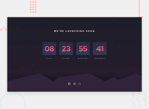
Design comparison
Solution retrospective
I found it difficult to implement the flip card feature.
Also, I think CSS could have been improved, in the cards for an appealing look.
I am awaiting your precious feedback.
Thanks.
Community feedback
- @mitkokazakovPosted 9 months ago
I think you should work on mobile version because it is not looking very good. About the flipping card for me was tough too. I could tell my approach. First you should have two upper and two bottom divs for instance. When flip starts you should rotate one of the upper divs 90 degrees on X axis. On the bottom side one of the divs should be initialy rotate 90 deg. And when the animation for the upper part ends you should rotate the bottom div in its initial position which is 0deg. You can check my solution.
Marked as helpful0
Please log in to post a comment
Log in with GitHubJoin our Discord community
Join thousands of Frontend Mentor community members taking the challenges, sharing resources, helping each other, and chatting about all things front-end!
Join our Discord
