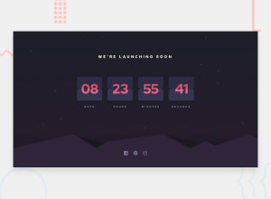
Design comparison
Solution retrospective
I could not impliment those cuts in between counter how could have I done it.
Community feedback
- P@nikoescobalPosted almost 3 years ago
Hello there! 👋
Congratulations on finishing your challenge! 🎉
To answer your question, there are multiple ways to approach this. One way you could use is to create black circles that have the same color as the outside, then adjust the positioning using margin to create that "cut effect."
Here's some other feedback on this solution:
- you forgot the social media icons below
- add letter spacing for your title and text below
- the spacing in between your cards is too much - you should adjust the padding/gap
- check the report to fix accessibility issues - you currently have 3 listed
I hope this is helpful and all the best with your coding journey!
0@master8848Posted almost 3 years ago@nikoescobal I have implemented social media icons git hub is not showing it idk why ,code is right there may be i forgot to git push thanks for other feedback😌
0
Please log in to post a comment
Log in with GitHubJoin our Discord community
Join thousands of Frontend Mentor community members taking the challenges, sharing resources, helping each other, and chatting about all things front-end!
Join our Discord
