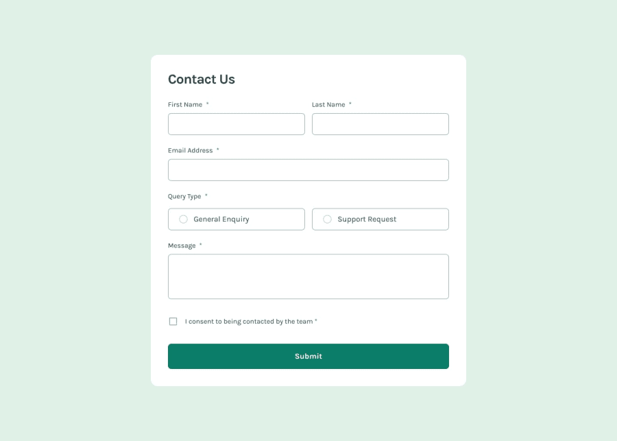
Design comparison
SolutionDesign
Solution retrospective
What are you most proud of, and what would you do differently next time?
I dont know how to validate the form properly or if using the things I did is any close to what you would normally use. Thankx.
Please log in to post a comment
Log in with GitHubCommunity feedback
- @Swag-blips
Hello Mags, Great work!
Below is my feedback
- Try widening the box div.
- The page color doesn't match the design.
- Customize the input outlines to align with the correct design.
- Add some spacing between the labels and their respective inputs to better match the design output.
- Grouped radio buttons inside a <fieldset> and associated them with a <legend> for better accessibility.
Join our Discord community
Join thousands of Frontend Mentor community members taking the challenges, sharing resources, helping each other, and chatting about all things front-end!
Join our Discord
