Design comparison
SolutionDesign
Community feedback
- @Mazz100Posted 5 months ago
Hi, I took a look at your solution and I would strongly recommend taking it a step back and follow up with challenge roadmaps on community. Furthermore, ask on help channel for valuable feedback form others.
Some of the work messing:
-
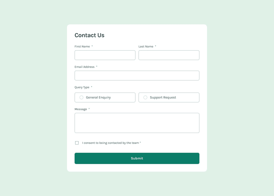
Responsive design breaks on small screens.
-
Form labels are messing.
-
Both radio inputs shouldn't be selected together so you need to have same
nameattribute for each and not leave them"". -
Design wise it can be improved as well.
Consider looking into non JS challenges first focus on your CSS skills and build up from there.
Good luck and keep going
0 -
Please log in to post a comment
Log in with GitHubJoin our Discord community
Join thousands of Frontend Mentor community members taking the challenges, sharing resources, helping each other, and chatting about all things front-end!
Join our Discord
