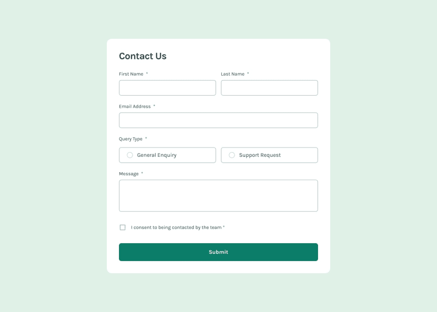
Design comparison
Solution retrospective
Feedback needed. Thank you
Community feedback
- @danielmrz-devPosted 4 months ago
Hey there! 🙋🏽♂️
Congrats on completing the challenge! ✅
Your project looks fantastic!
Here's a tip to make it even better:
Using
marginand/orpaddingisn't always the best way to center an element. Try this super efficient method to center an element vertically and horizontally:📌 Apply this CSS to the body (skip position or margins to make it work correctly):
body {
    min-height: 100vh;
    display: flex;
    justify-content: center;
    align-items: center;
}
Hope this helps!
Keep up the great work!
Marked as helpful0 - @krushnasinnarkarPosted 4 months ago
Hi @SIRBOLU,
Your solution is great and well-structured! However, here is some suggestions:
Centering the form: The form is not properly centered vertically, and this issue becomes apparent when the screen size is increased. To ensure the card is centered both vertically and horizontally, you can add
heightandalign-items: centerto the body element.body { display: flex; justify-content: center; align-items: center; padding: 2rem; height: 100vh; /* Ensures full height and centers the card */ /* existing styles */ }Summary By adding
align-items: centerandheight: 100vhto the main element, you can ensure that the card is perfectly centered in the viewport. This change enhances the layout's visual appeal and improves the user experience by making the content more accessible and aesthetically pleasing.Feel free to reach out if you have more questions or need further assistance. I hope you find my feedback valuable, and I would appreciate it greatly if you could mark my comment as helpful if it was!Marked as helpful0
Please log in to post a comment
Log in with GitHubJoin our Discord community
Join thousands of Frontend Mentor community members taking the challenges, sharing resources, helping each other, and chatting about all things front-end!
Join our Discord
