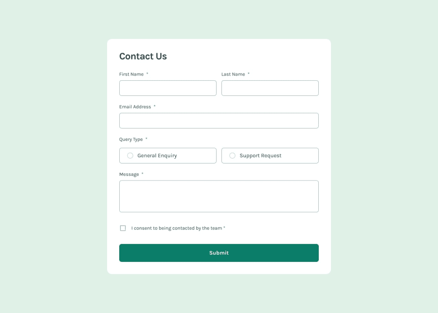
Design comparison
SolutionDesign
Solution retrospective
What are you most proud of, and what would you do differently next time?
Built with. 🔨
- React.
- Vanilla CSS (with CSS modules).
- Zod - Form validation.
- Vite.
Features. ✨
- Form validation using Zod, with error checking triggered on form submission.
- Form is fully keyboard accessible and inputs and error messages are properly announced to screen readers.
New Things Learned. 🎓
- React’s context API and the compound component pattern.
Notes. 📌
Based on some feedback i received, there are a few things i would like to improve in this solution if i revisit this again:
- Move the focus to the first input field with an error message (if any errors are present), after a submit attempt.
- When an error is present, it should then re-validate
onChange, so the error disappears immediately, rather than waiting until submission. - Validate
onBlurrather than waiting for the submit event.
Any feedback is appreciated!
Community feedback
Please log in to post a comment
Log in with GitHubJoin our Discord community
Join thousands of Frontend Mentor community members taking the challenges, sharing resources, helping each other, and chatting about all things front-end!
Join our Discord
