


Design comparison
Solution retrospective
In the process of completing this form, I will try to find the best solution. In this process, I learned a lot.
What challenges did you encounter, and how did you overcome them?In the process of completing this form, I encountered two problems, which made me a little entangled. I don't have a good solution. Here are the problems I encountered and the solutions
-
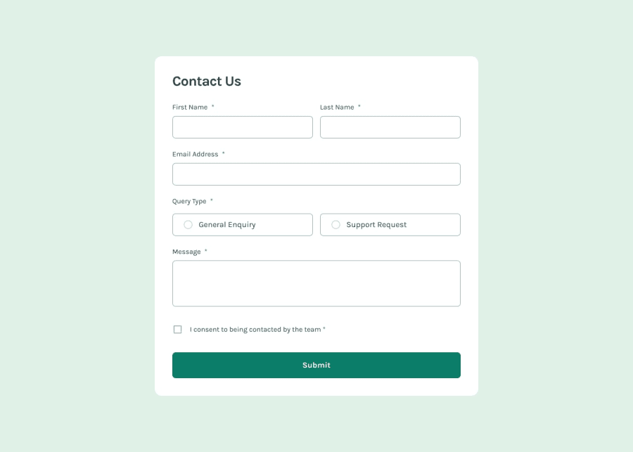
The
inputtag is added withrequired. At this time, the pseudo-class selector:invalidwill take effect directly during initialization, resulting in an error message being displayed as soon as the page is opened. I think this is not good.- Method 1: Add the
novalidateattribute to the form, and then check it yourself through js. This is too troublesome. - Method 2: Use
:foucus + :invalidto display the error message, which is only displayed when focused.
- Method 1: Add the
-
emailhas two checksrequiredandtype=email. Any failure in any check will make the pseudo-class:invalideffective, and there is a requirement to check the email format in the requirements. So here I can only use js to distinguish the check type and modify the corresponding text.
For the above problems, if you have a better method, please let me know, thank you
Community feedback
- @younes-atyqPosted 8 months ago
Hi, great job!
I recently watched Kevin's video addressing the same issue you encountered but in vanilla css.
I searched for that pseudo element in Tailwind CSS but couldn’t find it. If it hasn’t been added yet, you can always incorporate a custom CSS code into your project.
Additionally, it’s advisable to set a fixed height for your form elements. This way, when an error message appears, it won’t push the rest of the content down.
Marked as helpful0@mofadaPosted 8 months ago@younes-atyq Great,
:user-validcan help me, but it is too new and the compatibility is slightly poor.Regarding the issue of fixed height, your suggestion is correct, but in the UI design draft, the spacing in the error state is different from the spacing in the normal state. If it is developed according to the UI, I think non-fixed may be closer to the UI.
0@younes-atyqPosted 8 months ago@mofada While I agree that consistent spacing is crucial for a visually balanced design, I believe the advantages of avoiding disruptive content shifts in the error state through increased spacing in the normal state outweigh the potential drawbacks.
0@mofadaPosted 8 months ago@younes-atyq I think you're right, it's generally better to use
visibility, togglingdisplaycan cause jitter and cause elements to reflow.0

Please log in to post a comment
Log in with GitHubJoin our Discord community
Join thousands of Frontend Mentor community members taking the challenges, sharing resources, helping each other, and chatting about all things front-end!
Join our Discord