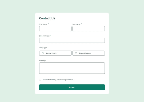
Contact Form with React/ React Hook Form/ Typescript

Solution retrospective
What I want to do
- I am trying to use SVG to replace the default radio button to give my webpage a consistent look across different browser.
- I want the SVG outer circle to grey out when it is not clicked
- when the radio button is clicked (in my case, it is the label, I wrapped the label around the radio button), then colored when it is clicked
SVG I used has separate into parts for better control (please see in README)
What I read and try
-
I read Inclusively Hiding & Styling Checkboxes and Radio Buttons and learn to use opacity 0 over visibility for better accessibility.
- using opacity 0 over sr-only can improve accessibility for users navigating by touch
- Both display: none and visibility: hidden remove the element they hide from the DOM and accessibility tree
-
I learnt from this two code pen, using Vanilla CSS to style the SVG when the checkbox/ Radio button is clicked. Their SVG has separate into parts for better control using class name
-
SVG example (please see in README)
-
using Vanilla CSS to style the SVG when it is checked
input:checked + svg { .radioDot, .radioOutline { opacity: 1; } } -
I also learn from this example, Custom Radio Buttons with only Tailwind CSS, this example taught me to use Tailwind peer.
- In Tailwind CSS, the peer-checked class can style elements that are siblings of the peer element when the peer element is checked.
Problem I have
- I cannot control individual parts of the SVG using Tailwind
- The peer-checked class will not work in my case because the element is not a direct sibling of the input element.
- In Tailwind CSS, I cannot directly target sibling elements with complex selectors like input:checked + svg .radioDot because Tailwind CSS is a utility-first CSS framework that generates utility classes for individual elements.
 input:checked + svg {
     .radioDot,
     .radioOutline {
       opacity: 1;
     }
   }
How I solve it
- I used a similar approach as https://marek-rozmus.medium.com/styling-checkbox-with-tailwind-46a92c157e2d
- I put two SVG on top of each other and change their opacity.
Please suggest a better solution.
Please log in to post a comment
Log in with GitHubCommunity feedback
No feedback yet. Be the first to give feedback on edpau's solution.
Join our Discord community
Join thousands of Frontend Mentor community members taking the challenges, sharing resources, helping each other, and chatting about all things front-end!
Join our Discord