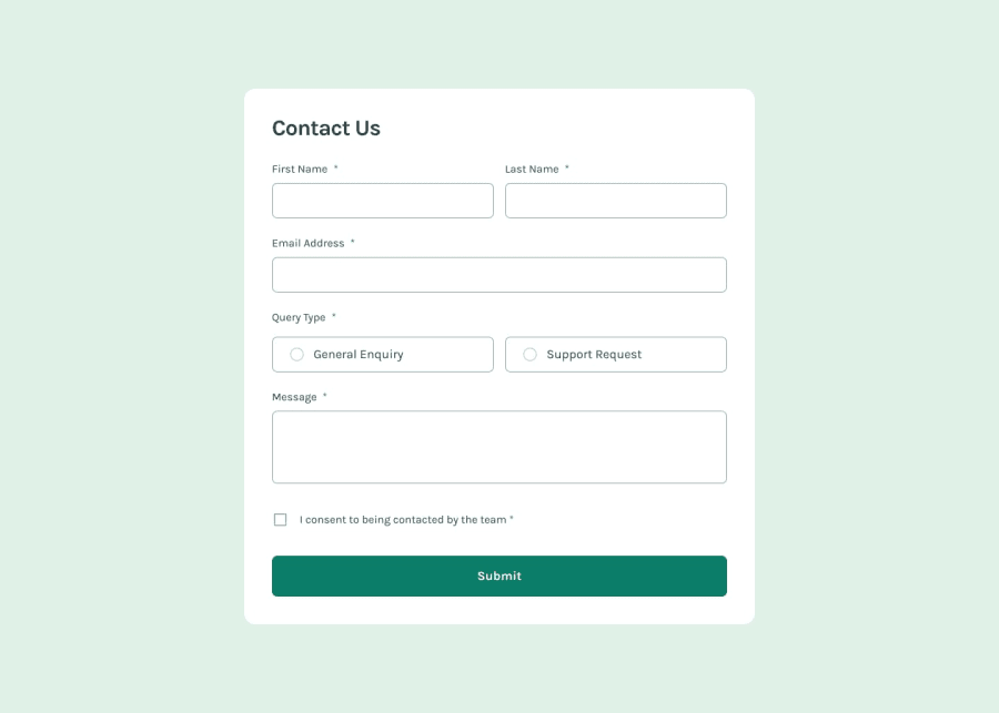
Contact Form with React
Design comparison
Community feedback
- @Grego14Posted 9 months ago
👋 Hello! 🎉 Congratulations on completing the challenge. 🎉
You are incorrectly using the
aria-labelattribute in the inputs. Thearia-labelattribute is used to specify a description to an element when there is nothing to describe it... as a button that only contains an icon and not text. And since you're using labels that point to the inputs you don't need to usearia-label.Since you're using
role='alert'I recommend that you read about the 👉 aria-live and 👉 aria-atomic attributes as these will help you let the user know that there's an error.I recommend using 👉 W3C Markup Validation to check for errors in your HTML code.
You're using a label tag for references to an element that isn't a form-control div#queryType.
To group elements such as radio inputs use the Fieldset tag. And since you're using radio-type inputs, you need to add the radiogroup role to the fieldset.
You're using the labels of the firstName, lastName, and email inputs to reference the same firstName element.
I hope this helps! 😁
Marked as helpful0
Please log in to post a comment
Log in with GitHubJoin our Discord community
Join thousands of Frontend Mentor community members taking the challenges, sharing resources, helping each other, and chatting about all things front-end!
Join our Discord
