Submitted 5 months ago
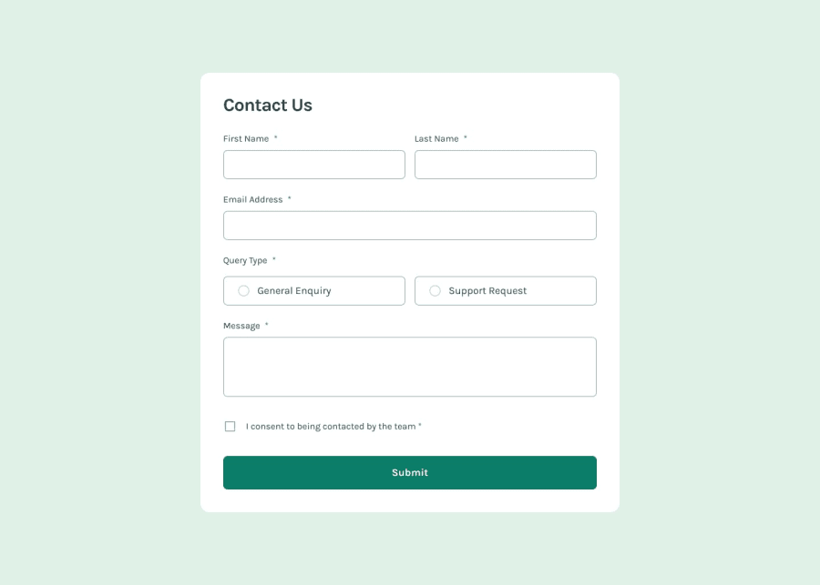
Contact Form with Modern Form enabled using React
@nikbhaladhare2104
Design comparison
SolutionDesign
Solution retrospective
What are you most proud of, and what would you do differently next time?
I have added the dark mode for the form which looks really modern. But I have omitted the interactive part of the challenge as I have already worked on that.
What challenges did you encounter, and how did you overcome them?Some CSS properties for the Button toggle. Extensive trial and run method.
What specific areas of your project would you like help with?No but again i want to re-iterate that this project doesn't adhere to the interactiveness of the challenge as I am trying to add new things in the project.
Community feedback
- @Aalphakeem-AdroitPosted 5 months ago
Not bad! I love the fact that you incorporated Dark and Light mode ❤️
1
Please log in to post a comment
Log in with GitHubJoin our Discord community
Join thousands of Frontend Mentor community members taking the challenges, sharing resources, helping each other, and chatting about all things front-end!
Join our Discord
