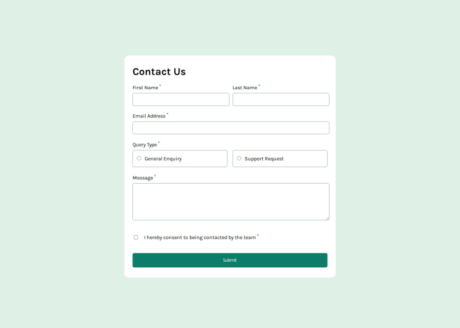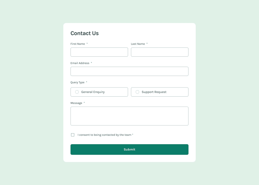
Design comparison
Solution retrospective
validation is maybe a bit complicated but it works i think :)
What challenges did you encounter, and how did you overcome them?am not sure the screen reader is working as it should; could you turn on voiceover and let me know what happens.? Thanks very much
What specific areas of your project would you like help with?screen reader
Community feedback
- P@Jolijn0101Posted 8 months ago
Hi Makha, I had promised to look at your code. I didn’t forget it ;) I needed a long time to finish the challenge myself.
Your solution looks great. I opened it with Chrome and used voice over to check how accessible it was. The form is accessible with keyboard. It already read out de name and that it was required of the First Name, Last Name, Email Address, Query type and the checkbox. The message field was red only by the label name it gave not an indication that it was required.
After submitting without any text in de input fields it gave the necessary error messages but it is not read out by voice over. The same about the succes message. For people with sight it works fine for blind people there are points to improve. If your interested to do so.
I came across this video tutorial about making alert messages that could be read by a screen reader. This is the link to that video: https://www.youtube.com/watch?v=5lzAj1ahRSI
While testing your code I saw that the font-family of the text-area is different from the rest of the input fields. The font-family is set on the body in css but the text-area and input fields will ignore it…
I hope this feedback was useful and I wish you a lot of fun making other challenges on front-end mentor.
Marked as helpful0@mbd89Posted 8 months ago@Jolijn0101 '' The font-family is set on the body in css but the text-area and input fields will ignore it… '' I didnt know this. thanks very much for your feedback as usual. will check the video tutorial. THanks
0 - @krushnasinnarkarPosted 9 months ago
Hi @mbd89,
Congratulations on successfully completing the challenge! Your code is well-structured, and the website works perfectly across different screens.
I have suggestions regarding your code that I believe will be of great interest to you.
-
Error Message Placement: When the form is submitted without filling in the required fields, the error messages appear, causing the entire form to increase in height. This doesn't look very appealing. Instead, try showing the error messages within the gap between two fields. You can achieve this by increasing the gap (adding some margin) and positioning the error message as absolute so it displays within that margin area rather than taking up separate space.
-
Padding Adjustment: Reduce the padding of
label[for="consent"]topadding-block: 1.0em;. This will make it more aligned with the overall design. -
Input Field Padding: When typing a text, it collides with the border. You can avoid this by adding
padding-left: 20px;toinput:not([type="radio"]):not([type="checkbox"]). After adding the padding, you need to adjust the width usingwidth: calc(100% - 20px);.
I hope you find this helpful, and I would greatly appreciate it if you could mark my comment as helpful if it was.Feel free to reach out if you have more questions or need further assistance.
Happy coding!
Marked as helpful0 -
Please log in to post a comment
Log in with GitHubJoin our Discord community
Join thousands of Frontend Mentor community members taking the challenges, sharing resources, helping each other, and chatting about all things front-end!
Join our Discord
