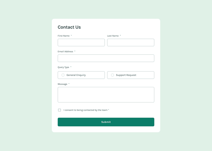
Contact form with inline field validation with React
Design comparison
Solution retrospective
I'm proud of getting the form so that the NVDA screen reader notifies users of errors in a reasonable way.
For a project this size, I probably wouldn't do too much different. My CSS could use some more organization here.
What challenges did you encounter, and how did you overcome them?I had a hard time taking advantage of native browser HTML5 form validation with React. I wrote a little hook that takes a ref to an element that allows me to use validation information on render, as well as a MessageBoxInput component that helps automate some error messages.
What specific areas of your project would you like help with?Any tips for better accessability, or organization in React projects would be nice!
Community feedback
- @filipjuszczakPosted 9 months ago
Hi!
I see you're using CSS modules to style your app. In this example:
<div className={styles["App"]}>
      <main className={styles["main"]}>
      ...
your class names are single words (any string that is a valid object key - e.g. no hyphens), so you could just do this:
<div className={styles.App}>
      <main className={styles.main}>
      ...
It's not a big deal, but looks a bit nicer.
0
Please log in to post a comment
Log in with GitHubJoin our Discord community
Join thousands of Frontend Mentor community members taking the challenges, sharing resources, helping each other, and chatting about all things front-end!
Join our Discord
