Design comparison
SolutionDesign
Solution retrospective
What are you most proud of, and what would you do differently next time?
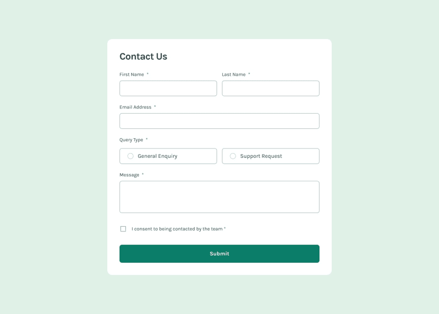
Most of the elements were similar, so i provided some of them same class name. Less css.
What challenges did you encounter, and how did you overcome them?I did not used the radio icons, so i prefer to design everything from scratch. The radio buttons, the check mark are all handmade.
BTW i did not completed the form yet, but all it's equipment's are ready.
What specific areas of your project would you like help with?Making a custom radio buttons.
Community feedback
Please log in to post a comment
Log in with GitHubJoin our Discord community
Join thousands of Frontend Mentor community members taking the challenges, sharing resources, helping each other, and chatting about all things front-end!
Join our Discord
