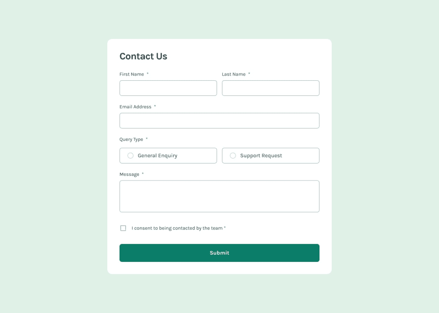
Contact form with form validation and Animated success modal
Design comparison
Solution retrospective
I started this challenge as I haven't done one in while, not since before I started my bootcamp. I wanted to go back to the fundamentals and test what i have learned since.
As this was a frontend only version I decided to just use vanilla JS and CSS.
Initially I thought that using React would be overkill for a simple form component. But looking at and modifying the form elements individually, I could see the case for creating reusable form components. Maybe in a another challenge or next crack at this, I will try that.
What challenges did you encounter, and how did you overcome them?Surprisingly the most difficult thing I found was changing the checkbox and radio button checked images. I have never had to do this before. After some research I found out that you need to set the image as a background to the label linked to the checkbox. The code for css is below.
.consent input[type='checkbox'] {
  height: 1rem;
  width: 1rem;
  appearance: none;
  border-radius: 0;
  border: 1px solid var(--primary-medium);
}

.consent input[type='checkbox'] + label {
  background: var(--neutral);
  background-repeat: no-repeat;
  display: inline-block;
  cursor: pointer;
}

.consent input[type='checkbox']:checked {
  background-image: url(/assets/images/icon-checkbox-check.svg);
  background-size: cover;
  background-repeat: no-repeat;
  border-color: transparent;
}
I would like to know how to improve the accessibility of the form, for example: users of screen readers
Community feedback
Please log in to post a comment
Log in with GitHubJoin our Discord community
Join thousands of Frontend Mentor community members taking the challenges, sharing resources, helping each other, and chatting about all things front-end!
Join our Discord
