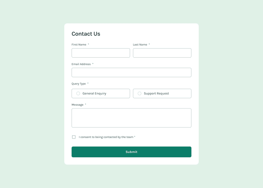
Contact Form with Flex and ARIA Attributes
Design comparison
Solution retrospective
One thing that I did like was being able to style the radio button and checkbox with CSS by using the accent-color attribute with a specified width and height to make a size for the radio buttons and checkmark. See code below:
.form__input-radio {
  display: block;
  width: 18px;
  height: 18px;
  accent-color: var(--clr-green);
}
In this way, it made the challenge a lot easier to handle since I didn't need to use divs to create a custom element.
Doing this challenge differently:
- Using divs to style the components
- Look into creating custom web components with JavaScript, HTML, and CSS (if anybody has any resources on that please lmk, mahalo in advance).
How often should we be placing aria-label for our components? Should this be for every major section that is apart of your component or should this be used for sections / parts where they may not be some sort of indicator to describe the content within?
Please log in to post a comment
Log in with GitHubCommunity feedback
No feedback yet. Be the first to give feedback on Levi Kuhaulua's solution.
Join our Discord community
Join thousands of Frontend Mentor community members taking the challenges, sharing resources, helping each other, and chatting about all things front-end!
Join our Discord
