Submitted over 1 year agoA solution to the Contact form challenge
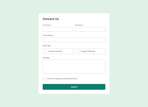
Contact form with emphasis on accessibility
P
@AcharaChisomSolomon

Solution retrospective
What are you most proud of, and what would you do differently next time?
:) Another deceptively simple project, I am proud of sticking to accessibility principles and limiting myself to as few aria- attributes as possible. I stuck to aria-invalid and aria-describeby for the error messages so that screen readers can read with the proper context.
What challenges did you encounter, and how did you overcome them?Sticking with accessibility was a pain but I persevered
What specific areas of your project would you like help with?My js file might be a little cluttered, any help there is welcome!!! also any feedback on any other section is helpful!!!
Code
Loading...
Please log in to post a comment
Log in with GitHubCommunity feedback
No feedback yet. Be the first to give feedback on Achara Chisom Solomon's solution.
Join our Discord community
Join thousands of Frontend Mentor community members taking the challenges, sharing resources, helping each other, and chatting about all things front-end!
Join our Discord