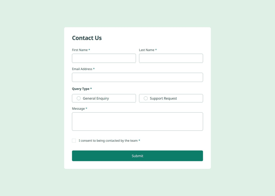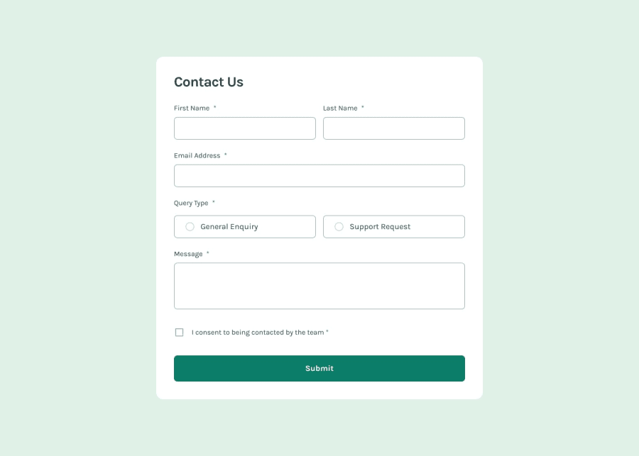
Contact form whit React, Typescript and Formik
Design comparison
Solution retrospective
I'm happy to have created components following the shadcn logic, to have practiced with accessibility and to have discovered new aria attributes
What challenges did you encounter, and how did you overcome them?Customizing the radio and checkbox inputs was very stimulating, especially making them accessible
What specific areas of your project would you like help with?All feedback welcome 😃
Community feedback
- P@VishikaPosted 6 months ago
Quite a good solution you have here! I really liked the user experience of your validation. And the focus styling you used.
I think it was also the case for me that customising the checkbox and radio inputs were the most interesting.
The only accessibility hurdles I had were
- When tabbing to "General Enquiry" it takes two 'tab' presses to go to "Support Request". I would imagine this is a better experience if it only takes one 'tab' press. Even better, the next tab should go straight to the message input (apparently the standard practice is to only include the first radio option in the tab index).
- While pressing 'tab' and 'space bar' work, for the radio option navigation, the arrow keys don't. Apparently that's standard practice too.
- Finally, ideally hitting the 'enter' key should be able to submit the form
Here is some documentation from w3 that suggests how we should be able to use the keyboard to navigate radio options and another from mozilla mozilla
Marked as helpful0
Please log in to post a comment
Log in with GitHubJoin our Discord community
Join thousands of Frontend Mentor community members taking the challenges, sharing resources, helping each other, and chatting about all things front-end!
Join our Discord
