Solution retrospective
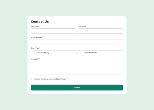
Pride: I am very proud to have implemented an accessible and visually appealing form that follows web design and accessibility best practices. Additionally, form validation in JavaScript is done efficiently, providing clear feedback to users about errors and how to correct them.
Changes: Next time, I would consider using a JavaScript testing framework to ensure that all validations, responsiveness, and functionality are consistently executed over time.
What challenges did you encounter, and how did you overcome them?One of the biggest challenges was ensuring that validation errors were displayed correctly without misaligning the other elements of the form. Initially, error messages moved out of position when fields were filled, affecting the user experience.
What specific areas of your project would you like help with?I would like help optimizing the accessibility of the form, ensuring that all users, including people with disabilities, can easily interact with the form. Additionally, I would like guidance on best practices for state management in more complex applications and how to implement automated testing effectively.
Please log in to post a comment
Log in with GitHubCommunity feedback
No feedback yet. Be the first to give feedback on Eduardo Elias Chacon's solution.
Join our Discord community
Join thousands of Frontend Mentor community members taking the challenges, sharing resources, helping each other, and chatting about all things front-end!
Join our Discord