Design comparison
SolutionDesign
Solution retrospective
What are you most proud of, and what would you do differently next time?
Responsive Design:
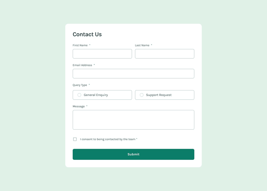
The contact form is designed to be responsive and adjusts well to different screen sizes using Tailwind CSS classes. This ensures that users on various devices can access and use the form comfortably.
Accessibility and Usability:
Labels and required indicators are clearly associated with form fields, improving accessibility. The form uses semantic HTML elements which are crucial for screen readers and assistive technologies.
Community feedback
Please log in to post a comment
Log in with GitHubJoin our Discord community
Join thousands of Frontend Mentor community members taking the challenges, sharing resources, helping each other, and chatting about all things front-end!
Join our Discord
