Contact Form using server-side validation and Netlify Functions
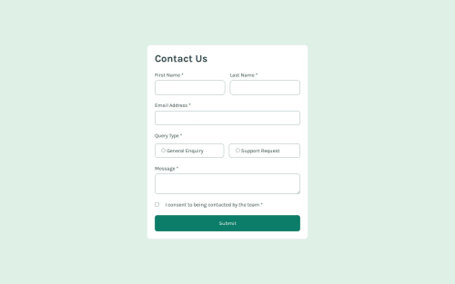
Design comparison
Solution retrospective
I used this challenge as an excuse to play around with Netlify Functions, which were remarkably user-friendly in the end. It was also the first time I've tried using GitHub Copilot on a personal project. Fun stuff!
I'd love to learn how to properly test my TS code. I'm not very familiar with unit testing TS/JS, so getting used to that could be good going forwards. I'm aware that a lot of my functions have side-effects so testing them as-is would be tricky; I'd likely need to refactor my code to be more functional and pure in order to test it effectively.
What challenges did you encounter, and how did you overcome them?For some reason I really struggled to get the fonts loaded properly, which I didn't expect considering the fonts are loaded locally. I suppose Parcel prefers you to purely src: url("fonts/static/whatever")
, rather than also adding something to the ``.
If you have any code quality or accessibility suggestions please let me know, as I'm aware I somewhat rushed the frontend side of things so I could get stuck in with faffing with TypeScript and Netlify Functions.
Community feedback
- @grace-snowPosted 6 months ago
Hey James
A few things I notice just from reading the code (I haven't tested):
- all required fields should have the required attribute, or failing that aria- required.
- autocomplete should not be off on email
- the trouble with pre-filling error messages like this is that they can't be programmatically linked to their inputs as they should be. I recommend you wrap the errors or group of errors in one div for each firm control, give it a unique ID and aria-live attribute, then use aria-desciribedby on the input pointing to that live region. As long as the actual errors inside those regions are display none when hidden and block ot similar when visible they will be announced correctly by screen readers and be programmatically linked to their inputs (so read out after the input label)
- it's not in the design yet (I've requested a change) but there should be a line at the start of the form saying that asterisks denote a required field.
- if radios are required one of the group needs a required attribute (or failing that, aria-required as mentioned above).
- similar to the above, aria-live regions must not be display none or they won't be tracked for changes correctly. The content within them can be display none. I recommend you add a wrapper around the toast notification and place aria-live on that instead.
- changing background colour is not sufficient as a focus-visible style. It's more appropriate as a hover style. Focus visible needs to be very clear / obvious. Sadly the specific guidance on what focus style should look like got pushed to a AAA level criterion instead of AA but it still provides the clearest guidance on what focus outlines should look like: 2.4.3 Focus Appearance
- when using the form and the errors come up the page loads in a really strange location. At least the field where the first error is should be focused and in view.
Marked as helpful1@james-work-accountPosted 6 months ago@grace-snow thank you for the review!
- I intentionally left off
required
so that the validation could be done server-side, however I forgot to addaria-required
. I'll get that added, thank you. autocomplete
was something I left on by accident - during development my password manager kept trying to fill it in and it got on my nerves 🫠 good spot, will remove.- Interesting, I will read up on that thank you.
- I'll add that in anyway, sounds like a good addition!
- Again I left
required
off so the validation could be done server-side, but I'll addaria-required
for a11y users. - I didn't know that - so I'll need an element with
aria-live
on it, then adisplay: none
element inside it? TIL! - I'll look to change this, thanks. I was having some troubles with outlines not following the border-radius properly (resulting in a rectangle overlayed on a rounded-off rectangle), but I guess I shouldn't be doing things at the expense of a11y.
- I don't understand your last point - are the errors not displaying with their respective fields for you?
0@grace-snowPosted 6 months ago@james-work-account the last point: I was viewing on my phone which has a fairly small screen. On click of submit, it was like the page jumps to the middle of the page. I had to scroll up to find the first field that had an error. (I can't tell you how common this is with sites built using JS frameworks because focus isn't managed and the pages dont load like on a traditional website where you would always go to the top!)
0@james-work-accountPosted 6 months ago@grace-snow Oh I think I understand what's happening, I believe the form is centred vertically on the page so when the errors render it expands both up and down. I'll see how I can best fix that...
FWIW I used Parcel basically just as a bundler. The bulk of this is written with pure HTML, SCSS and TS. That being said, focussing on the first field with an error is a good idea, I'll implement that too 🙂 might end up solving one problem by implementing a separate feature haha
0@grace-snowPosted 6 months ago@james-work-account yes that should fix it because the first field, once focused, would immediately move into view. And it would make a nicer UX anyway :)
0@james-work-accountPosted 6 months agoHi again @grace-snow - just wondering about your third point, would changing this:
<div class="input-wrapper"> <label for="first-name">First Name <span class="required-symbol">*</span></label> <input type="text" id="first-name" name="first-name" autocomplete="given-name" aria-required="true" /> <span class="error" id="first-name-required" data-for="first-name">This field is required</span> </div>
to this:
<div class="input-wrapper" id="first-name-wrapper" aria-live="polite"> <label for="first-name">First Name <span class="required-symbol">*</span></label> <input type="text" id="first-name" name="first-name" autocomplete="given-name" aria-required="true" aria-describedby="first-name-wrapper" /> <span class="error" id="first-name-required" data-for="first-name">This field is required</span> </div>
suffice?
0@grace-snowPosted 6 months ago@james-work-account I would need to test that on a few screen readers. I think it would lead to loads of horrible announcements because everything you type would count as an update to that region. So this wouldn't be recommended.
0@james-work-accountPosted 6 months ago@grace-snow that makes sense, though I'm not sure how to implement this then: "I recommend you wrap the errors or group of errors in one div for each firm control, give it a unique ID and aria-live attribute, then use aria-desciribedby on the input pointing to that live region."
Unless I've misunderstood, and you mean something like this:
<div class="input-wrapper"> <label for="first-name">First Name <span class="required-symbol">*</span></label> <input type="text" id="first-name" name="first-name" autocomplete="given-name" aria-required="true" /> <div id="first-name-error-wrapper" aria-live="polite"> <span class="error" id="first-name-required" data-for="first-name" aria-describedby="first-name-error-wrapper">This field is required</span> </div> </div>
? Which, re-reading your comment, makes a lot more sense the more I think about it...
0@grace-snowPosted 6 months agoThat's closer @james-work-account but the aria-desciribedby goes on the input and points to the unique ID of the error wrapper.
The key things are
- the aria-desciribedby must point to an element containing the error.
- the element containing the error therefore needs a unique ID and an aria-live attribute.
- aria-live elements must be in the DOM at all times (not conditionally rendered and not display none).
- that error element must effectively have no content inside by default. So either the whole error message is empty or the inner error element (the message) can be display none.
- when an error is present the inner error message gets display block or it's text content is populated, meaning the aria-live region's contents has updated and an announcement will be made.
One thing I'd need to test though - as you're validating in the server does that mean there is a whole page refresh? Is their any client side validation as well? (Eg after submit does client side validation trigger as people interact with the inputs?). If so, you may need
role="alert"
on these messages. I'd have to test it to know for sure.0
Please log in to post a comment
Log in with GitHubJoin our Discord community
Join thousands of Frontend Mentor community members taking the challenges, sharing resources, helping each other, and chatting about all things front-end!
Join our Discord