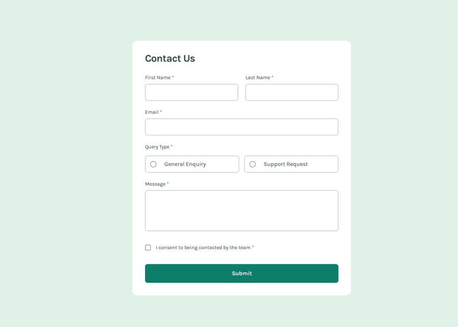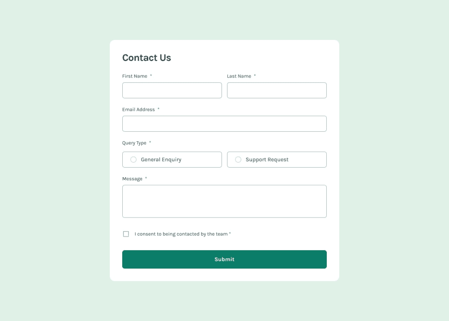
Contact Form using React.js and tailwind CSS
Design comparison
Solution retrospective
React, Tailwind CSS, mobile-first approach
What challenges did you encounter, and how did you overcome them?none.
What specific areas of your project would you like help with?Any feedback is welcome!
Community feedback
- @wendyhamelPosted 6 months ago
Hi there,
Nice work on this solution!
I noticed a horizontal scroll bar on sizes < 185px wide screens. The margin on your
<section>with the form (first one in the #root, not the second containing the success message) is the cause. One way to solve this is removing the margin from the<section>and use a padding on the containing<div id="root">instead.But that's it! The rest of your code looks good.
Happy coding!
Marked as helpful1
Please log in to post a comment
Log in with GitHubJoin our Discord community
Join thousands of Frontend Mentor community members taking the challenges, sharing resources, helping each other, and chatting about all things front-end!
Join our Discord
