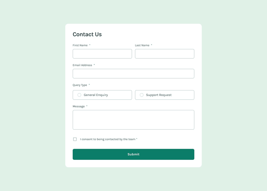
Contact form using React, Typescript and Tailwind
Design comparison
Solution retrospective
My custom component for the radio button
Community feedback
- @grace-snowPosted 7 months ago
I'm afraid this looks like it has serious html problems with the form. Forms are a key area of Web accessibility where you need to understand the importance of good html structure. It's simple stuff but very very important.
- every input must have a programmatically linked label. That labels for attribute value needs to be the id of the input and this must be a valid id, no spaces or extra symbols.
- inputs collecting personal data must have valid autocomplete attribute values appropriate for the data being collected.
- radios must be grouped in a fieldset with a legend for the group label (or grouped in a div with a role of group and aria-labelledby pointing to the unique ID of the labelling text).
- errors need to be linked to their inputs using aria-desciribedby pointing to the unique id of an aria-live region wrapping the error message thats always present in the dom.
- decorative icon images should have empty alt.
- you'll either need to manage focus or wrap conditionally rendered content in an aria-live region so the new content gets announced by screen readers.
- inputs need name attributes for the data to be usable.
- radio values are set on change not on click. There should be no click listeners anywhere in this, only a submit listener on the form.
- you must never have click listeners on divs or other non interactive elements.
- all content should be contained within landmarks. This form belongs inside a main.
I hope this is all helpful. Mdn docs about forms is very good if you need more info.
Marked as helpful0P@donado10Posted 7 months ago@grace-snow For the click listeners inside a div, can you give me a workaround for that
0@grace-snowPosted 7 months ago@donado10 to use interactive elements. There's never a reason to have a div be clickable. Think through the functionality of what needs to happen and choose the appropriate elements. In a form there should be no need for any click listeners anywhere because forms use form elements and all data is in the form. And all that needs is a submit listener. You may have additional listeners for validation reasons but those would be things like blur or possibly change.
The key issue is malformed HTML for a fieldset of radio inputs. I would remove the click listeners altogether, wrap the inputs and text in their label instead. And make sure the fieldset (or group) has a legend (or aria-labelledby text). And the radios need a name so they store data and so that they work with a keyboard.
This is foundational form stuff really.
0P@donado10Posted 7 months ago@grace-snow Thank you for your advice 😁. I will follow your advice. Can I update the solution and comeback to you ?
1 - @Obinna-NwankwoPosted 7 months ago
am looking for where to contribute is there are space or place you can refer to me
0@grace-snowPosted 7 months ago@Obinna-Nwankwo this is someone else's solution. If you're not sure how to use frontend mentor I recommend looking at the learning paths page. There is a "getting started" one.
If you need help, head to the frontend mentor discord server.
0 - @Obinna-NwankwoPosted 7 months ago
this is a perfect contact from, can i use the source code
0
Please log in to post a comment
Log in with GitHubJoin our Discord community
Join thousands of Frontend Mentor community members taking the challenges, sharing resources, helping each other, and chatting about all things front-end!
Join our Discord
