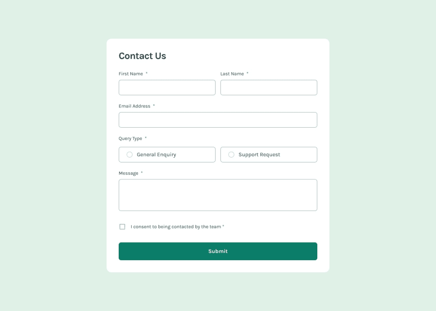
Design comparison
SolutionDesign
Solution retrospective
What are you most proud of, and what would you do differently next time?
I'm proud that I learned about grid layouts better, now I have a better notion on how they work in a we page. Next time I would like to make a better structure of my HTML, cause otherwise working with CSS will be hard and I will have to change my whole HTML.
What challenges did you encounter, and how did you overcome them?Grid layouts, making the css for the radio buttons.
What specific areas of your project would you like help with?I would like suggestions about the efficiency and readibility of my code. Also I would like to know where I can reduce redundacy and make the code clearer. Thank you for reading me and I hope this solution can help you!
Community feedback
Please log in to post a comment
Log in with GitHubJoin our Discord community
Join thousands of Frontend Mentor community members taking the challenges, sharing resources, helping each other, and chatting about all things front-end!
Join our Discord
