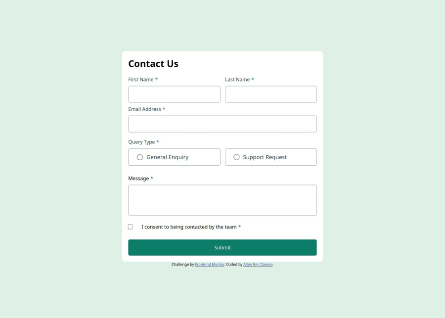


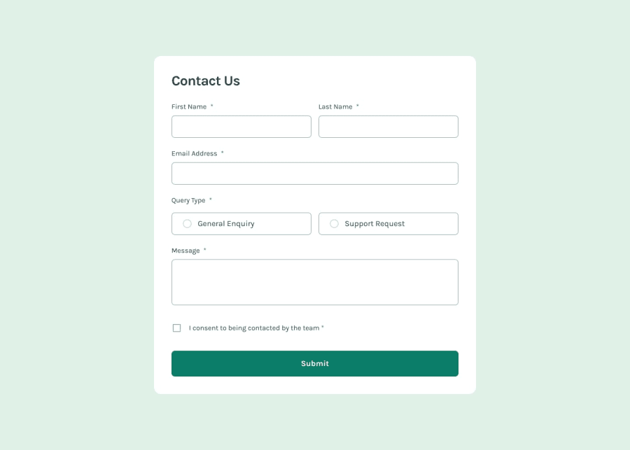
Design comparison
SolutionDesign
Community feedback
- P@makogeborisPosted 9 months ago
Hi allnyu, your solution looks great just need a few adjustments to make it better,
- Your .mcontainer seems to be cut off from the viewport notably when the error messages are displayed, to fix that change the
height: 100vhtomin-height: 100vhon yourbodyand some padding top and bottom. Also the container's max-width should be in rem.
Some suggestions:
- Font-size should be written in rem not px. This article explains it better Why font-size must NEVER be in pixels.
- Media queries should be defined in rem or em not px.
- Generally, when defining units you should use rem almost all the time because it scales with the base font-size set in the browser. Use em when you want a component to scale with the font-size of the current element, a button's padding is a great use case for em. Only use px on something you don't want the size to ever change.
- Consider using a modern CSS reset at the start of the styles in every project. Like this one Modern CSS Reset. This will help reset a list of default browser styles.
Hope this helps!
Marked as helpful1 - Your .mcontainer seems to be cut off from the viewport notably when the error messages are displayed, to fix that change the


Please log in to post a comment
Log in with GitHubJoin our Discord community
Join thousands of Frontend Mentor community members taking the challenges, sharing resources, helping each other, and chatting about all things front-end!
Join our Discord