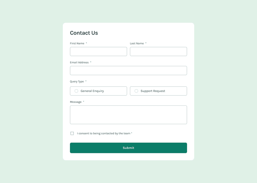
Design comparison
Solution retrospective
I am most proud of how the overall design turned out. Although I don’t consider myself highly skilled in design, I believe I did a good job.
What challenges did you encounter, and how did you overcome them?I encountered difficulties with the mobile design. The example image did not display the success message, so I assumed it should be placed in the same location as in the desktop design but made smaller. To overcome this, I adjusted the design to ensure the success message fit well on mobile screens.
What specific areas of your project would you like help with?I would like help with improving the responsiveness of my design across all types of devices. Additionally, any feedback on enhancing the visual appeal and user experience of the form would be greatly appreciated.
Community feedback
Please log in to post a comment
Log in with GitHubJoin our Discord community
Join thousands of Frontend Mentor community members taking the challenges, sharing resources, helping each other, and chatting about all things front-end!
Join our Discord
