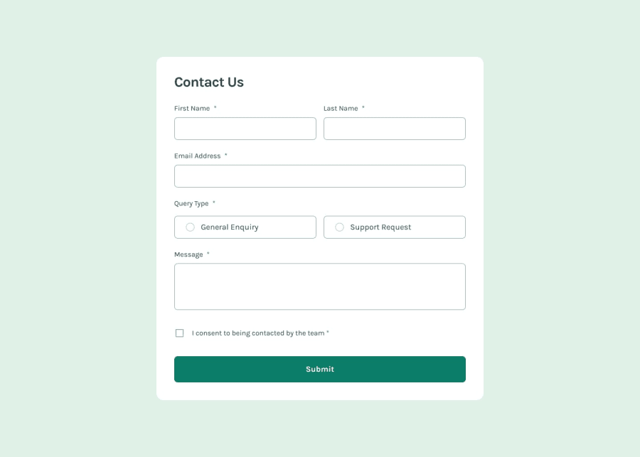
Design comparison
Solution retrospective
I would appreciate help with the desktop design, how to make the label elements (eg first name and last name) appear on the same line
Community feedback
- @LemnsaPosted 5 months ago
Congratulations :) on completing this task @Zuwaynib
Sure let's sort things out
You could separate the two input fields (label with the input) in a container (it can be a div)
Like so:
<div class="container">
            <label for="firstinput">firstinput <br>
                <input type="text" name="name" id="name">
            </label>
            <label for="second-input">second-input <br>
                <input type="text" name="name" id="name">
            </label>
    </div>
But we want to make things under control, so we use CSS to give the children elements in the parent(div) a display: flex
Doing so:
- The child elements spacing, positions could be adjusted with gap , justify-content or align-items depending on you.
Here's a sample CSS
I am using embedded CSS
@Zuwaynib hope this helps, and incase you are not still grabbing it refer to your learning materials and it get things done!
0@ZuwaynibPosted 4 months ago@Lemnsa
I appreciate your help. I have been able to fix the issues.
0
Please log in to post a comment
Log in with GitHubJoin our Discord community
Join thousands of Frontend Mentor community members taking the challenges, sharing resources, helping each other, and chatting about all things front-end!
Join our Discord
