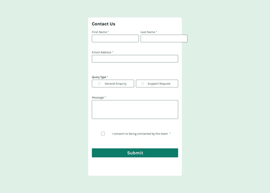


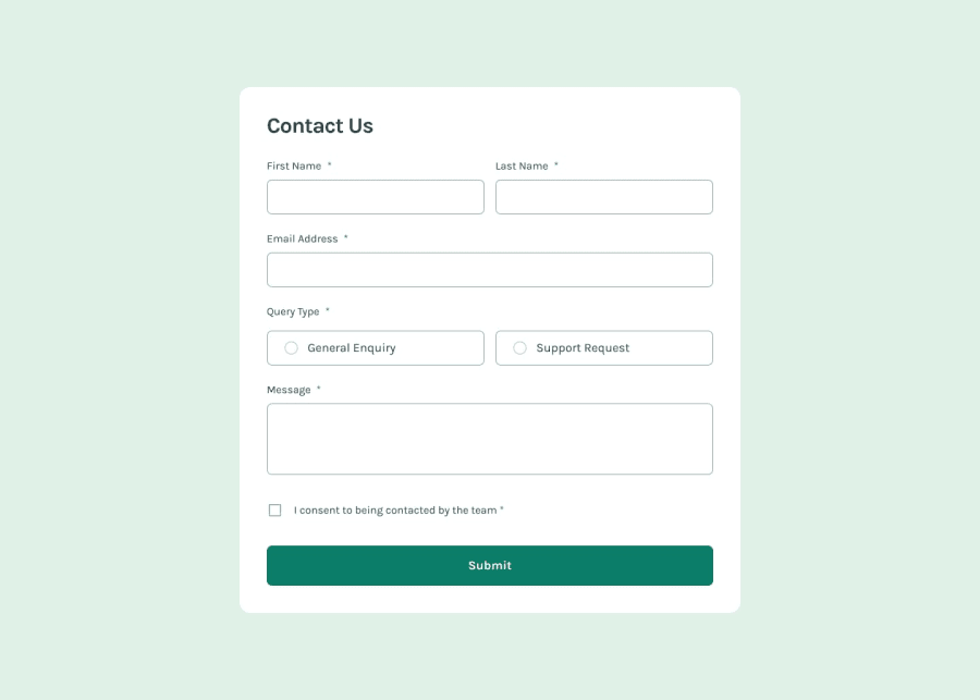
Design comparison
Solution retrospective
I'm proud of my solution to change the background colour of the radio buttons using JS, I learned a lot about using the foreach loop on a list of classes from queryselector instead of selecting each radio button individually and giving them both a separate function. Trying to follow DRY coding practises.
What challenges did you encounter, and how did you overcome them?I ran into issues with getting my radio buttons to change BG colour in my early versions of the code, but I was able to overcome them by using the "this" keyword to reference the function itself instead of trying to use an index in the array of radio buttons which I made.
What specific areas of your project would you like help with?I don't like the way I used visibility: hidden instead of display: hidden in my project. It leaves a lot of white space between the different sections. But when I use display: hidden my input shift up and down on the page ruining the whole layout.
For example(using display: hidden) First name and Last name are side by side, if the error text below First name is visible but the the error text below last name is hidden then the layout would shift first name upwards to fit the error text below it making first name and last name not line up side by side anymore.
Community feedback
- @feelgoodddPosted 3 months ago
I don't understand why my screenshot looks like this. The website itself on all devices I've tested looks fine.
Also on iPhone selecting an input box or the textarea zooms the screen in on the textbox which is annoying. I do not know how to fix this.
0

Please log in to post a comment
Log in with GitHubJoin our Discord community
Join thousands of Frontend Mentor community members taking the challenges, sharing resources, helping each other, and chatting about all things front-end!
Join our Discord