Contact Form using Astro and Sass
Design comparison
Solution retrospective
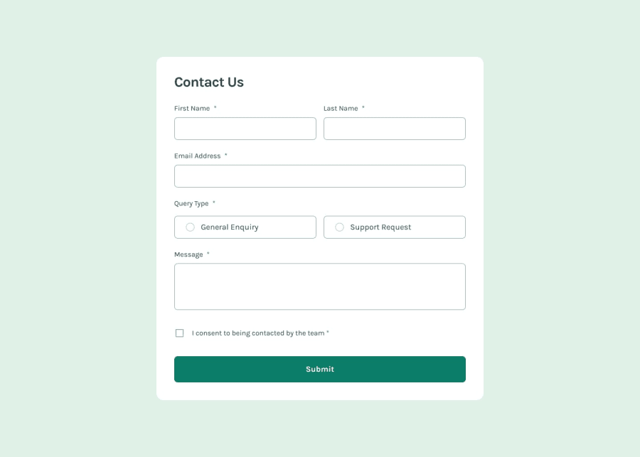
I'm most proud of how I used Astro's component-based structure to create a clean and maintainable form, ensuring accessibility for screen readers and other assistive technologies. This was especially important for elements like radio buttons and checkboxes, which I built from scratch, referencing resources like moderncss.dev to ensure a high level of accessibility and usability.
Next time, I would approach the project using a framework like React to improve code reusability and handle state management more effectively. Additionally, I would refactor some parts of the JavaScript, particularly the validation logic, to make it cleaner and more modular.
What challenges did you encounter, and how did you overcome them?One of the main challenges was ensuring the form was fully accessible. This involved making sure that all the elements, such as inputs, radio buttons, checkboxes, and error messages, could be properly announced by screen readers. To overcome this, I referenced best practices from modern CSS guides and thoroughly tested the form's accessibility using different tools.
Another challenge was creating custom components for form controls like radio inputs and checkboxes from scratch, ensuring they looked modern and were easy to interact with. I overcame this by experimenting with CSS and refining the layout until I achieved the desired design.
What specific areas of your project would you like help with?I'd like feedback on any suggestions on how to improve the accessibility and responsiveness of the form. Specifically, I'd love to hear if there's a more efficient way to manage form validation and toast notifications in Astro or in React for future iterations of the project.
Join our Discord community
Join thousands of Frontend Mentor community members taking the challenges, sharing resources, helping each other, and chatting about all things front-end!
Join our Discord
