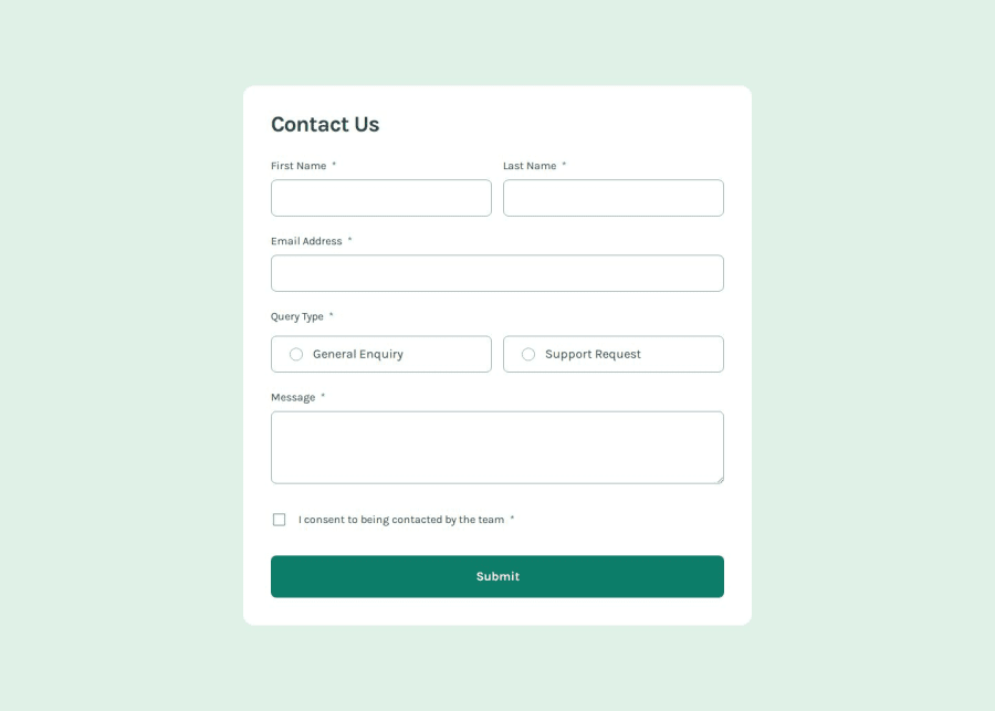
Contact form using 11ty and Valibot
Design comparison
Solution retrospective
I'm proud of taking a "first principles" approach and implementing the CSS and JS without a bundler, only using the native import features available in the browser. Not exactly ideal from a performance perspective, but it's good for learning. I promise I'll use a bundler next time. 😉
What challenges did you encounter, and how did you overcome them?HTML forms. Dividing the work in stages definitely helped keep things sane and manageable. So first I worked on structuring them semantically, then making sure they follow the design, and finally adding field validations. It's frustrating when I encounter a gotcha, but coming up with a workaround feels pretty satisfying. 😌
What specific areas of your project would you like help with?For accessibility testing, I'm limited to using VoiceOver on my iPhone SE, so feel free to let me know how I can improve the accessibility implementation. Of course, you can comment on other parts of the code as well!
Community feedback
Please log in to post a comment
Log in with GitHubJoin our Discord community
Join thousands of Frontend Mentor community members taking the challenges, sharing resources, helping each other, and chatting about all things front-end!
Join our Discord
