Design comparison
SolutionDesign
Solution retrospective
What are you most proud of, and what would you do differently next time?
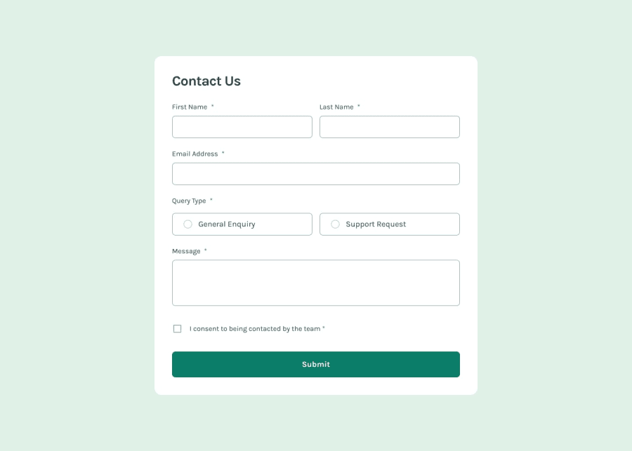
I'm really glad I didn't struggle styling the rows and columns of the input fields of the form like I used to in the past.
What specific areas of your project would you like help with?I would really like help with how to style the following input elements:
- radio buttons
- checkbox
I would also like to learn the object oriented method of modifying the styles (using JavaScript) of the above input elements when they are selected/not selected (in the case of radio buttons), checked/unchecked (in the case of checkbox)
Community feedback
Please log in to post a comment
Log in with GitHubJoin our Discord community
Join thousands of Frontend Mentor community members taking the challenges, sharing resources, helping each other, and chatting about all things front-end!
Join our Discord
