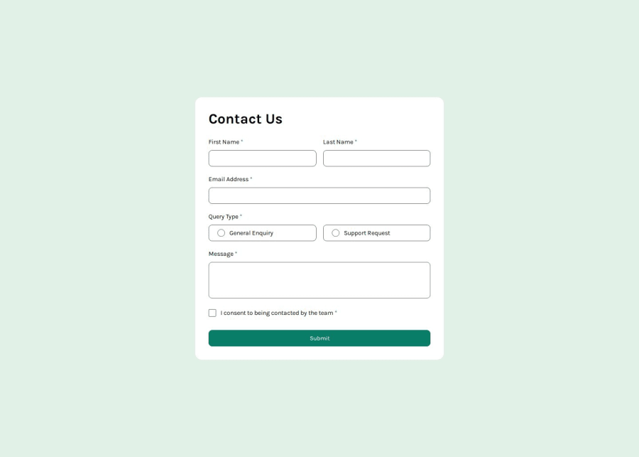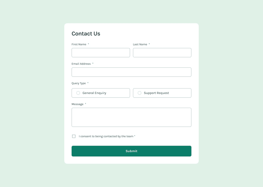
Design comparison
Solution retrospective
I am proud of being able to complete my first challenge and achieve the proposed goals. What I would do differently would be to research more, ask more questions and absorb my mistakes and bugs as learning experiences. I believe I deprived myself of the use of the research tool.
What challenges did you encounter, and how did you overcome them?I had difficulty adjusting the message sent after submitting the form information, because the page was reloaded after submitting it, so I couldn't get the form clean and with the message sent. My solution was to place the message sent after all the required information was filled out and submitted, and before the form refreshed, the message appeared. I also had difficulty understanding how to manipulate the DOM elements and understand the concept of the DOM tree. This happened in the areaOptions part to select the options and the radio. But I was able to solve it using if (optionsElement) and selecting each classList and adding and removing the active class.
What specific areas of your project would you like help with?I wanted help understanding how to make the code clean and easy to understand. I think I got confused when it came to clarifying the code. And what could I have done to simplify the code or used different things to get a better result. In short, feedback on the codes.
Community feedback
Please log in to post a comment
Log in with GitHubJoin our Discord community
Join thousands of Frontend Mentor community members taking the challenges, sharing resources, helping each other, and chatting about all things front-end!
Join our Discord
