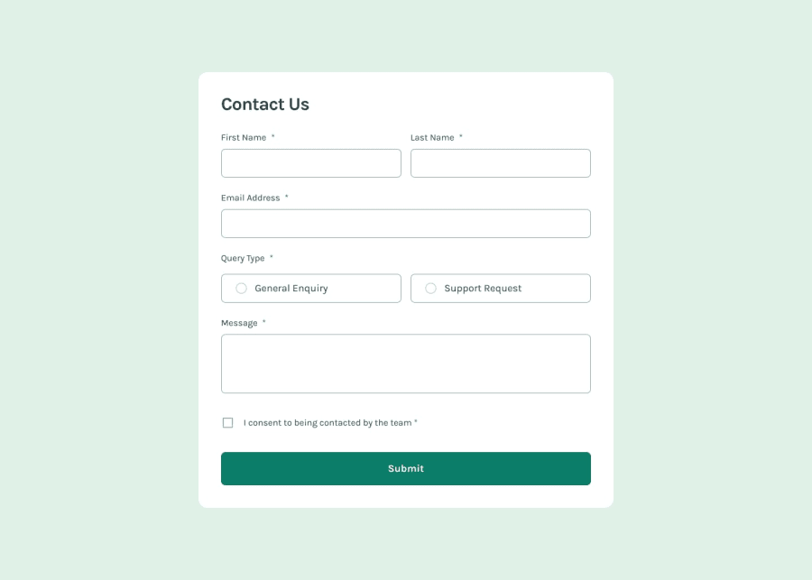
Design comparison
Solution retrospective
-Being able to display the error messages without using the alert property.
What challenges did you encounter, and how did you overcome them?-Displaying error messages without using the windows alert. getting the CSS layout to match the design target.
What specific areas of your project would you like help with?-Getting the CSS layout right. This took me longer than the actual Javascript function.
Community feedback
- @danielmrz-devPosted 5 months ago
Hey there! 🙋🏽♂️
Congrats on completing the challenge! ✅
Your project looks fantastic!
Here's a tip to make it even better:
Using
marginand/orpaddingisn't always the best way to center an element. Try this super efficient method to center an element vertically and horizontally:📌 Apply this CSS to the body (skip position or margins to make it work correctly):
body {
    min-height: 100vh;
    display: flex;
    justify-content: center;
    align-items: center;
}
Hope this helps!
Keep up the great work!
Marked as helpful1
Please log in to post a comment
Log in with GitHubJoin our Discord community
Join thousands of Frontend Mentor community members taking the challenges, sharing resources, helping each other, and chatting about all things front-end!
Join our Discord
