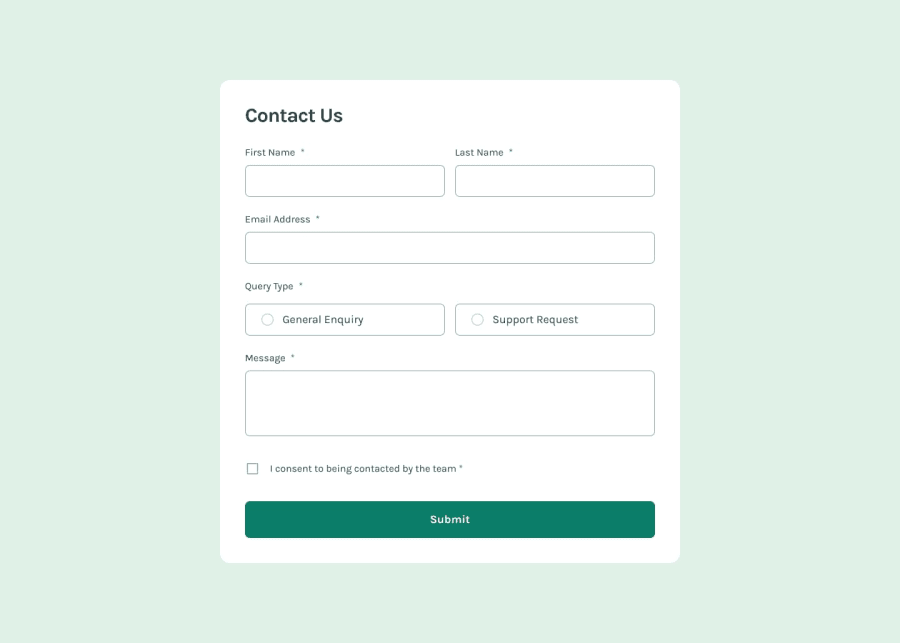
Design comparison
Community feedback
- @grace-snowPosted 2 months ago
Hi, good job on this.
Just make sure you
- add the missing autocomplete attributes on most inputs.
- add the missing required attributes on inputs.
- add the missing aria-live attributes on the error elements.
- add the missing aria-desciribedby on the radio inputs.
- ensure the labels on the radio inputs fill the area that looks clickable.
Personally I wouldn't use em as much as you are doing at the moment, and I'd ensure the max width on the component and media query definition are both in rem. I wouldn't expect this challenge to need so many media queries.
Marked as helpful1@MsadafKPosted 2 months ago@grace-snow ma'am, i have made all the necessary changes that you mentioned here and for @media-queries, i got your point what you are implying here, i ll keep this in my mind for future projects . now as far as css units are concerned, i use :
"rem" for font-size || "em" for margin & padding || "%" for width || "px" for max-width || "unitless number values" for line-height
i get these rules from a coding bootcamp named "SCRIMBA". they made ppt for explaining these rulings and reasons behind why to use them. now that being said, i am very open to adopt better approaches and if these rulings are not that better, then i am surely putting it down and going to jump on the better ones.(note : i still have those slides and if you want i ll send it to you on discord 😊)
so now, my question is, what are the most practiced set of rulings in context of css units. l hope you get my point what i am asking here.
0@grace-snowPosted 2 months ago@MsadafK there aren't fixed "rules", it's simply about understanding what the implications of using each unit will be.
For example, in prose content (like a blog post with lots of paragraphs and subheadings) it makes a lot of sense to use
emfor margin top (or gap) on all those elements. The space above each paragraph or heading is then proportionate to the font size of that element. The space above a heading will be a bit bigger than the space above a paragraph. That's great.But for padding on the sides of a container using
emmight lead to misalignments as you scroll down a page because of different font sizes on different elements. Similarly, usingremoremcould lead to very narrow containers for users who have a larger text size setting, because the inline padding will increase along with default text size — suddenly pixels make lots more sense there for consistent spacing. If a user has a text size of 16 or 32 the inline padding would stay the same if px was used there.See how all this is about learning the pros and cons of each unit.
Personally I only use em in very specific circumstances and it's not common. Eg. I'll use em for: Vertical margins / gap in long form text elements (as already described), button padding (so the button can be made larger/smaller just by changing font size), and letter-spacing. These are the only examples I can think of where I intentionally want a property to scale with the current font size of an element. And that is what em is for.
Marked as helpful1@MsadafKPosted 2 months ago@grace-snow Thank you so much for your detailed feedback and explanations, ma'am. I really appreciate the time you've taken to help me improve my work.
Your insights on CSS units and responsive design were eye-opening. I now understand that it's not about following strict rules, but about choosing the right unit based on the specific needs of each element and the overall design goals.
Your examples about when to use em and when it might cause issues were particularly helpful. I'm intrigued by your approach of using em sparingly for specific cases like vertical margins in long-form text, button padding, and letter-spacing.
I'm looking forward to applying these principles in my next project, paying more attention to how different units affect layout and responsiveness, and being more thoughtful about my use of media queries.
Thank you again for your guidance. It's incredibly valuable to learn from your professional experience.
0
Please log in to post a comment
Log in with GitHubJoin our Discord community
Join thousands of Frontend Mentor community members taking the challenges, sharing resources, helping each other, and chatting about all things front-end!
Join our Discord
