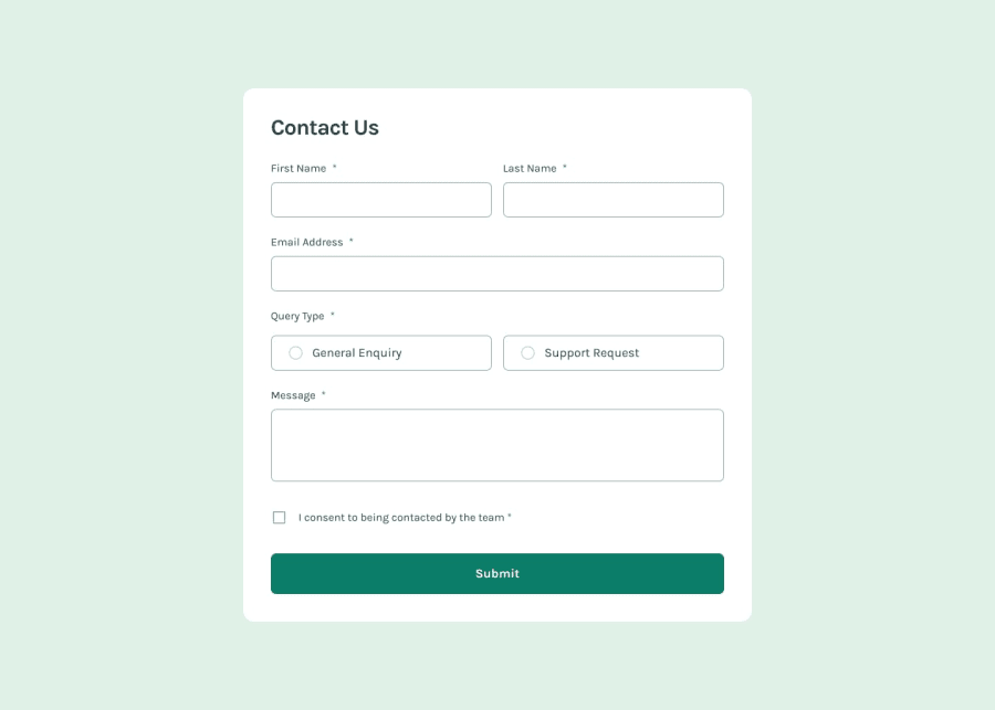
Design comparison
SolutionDesign
Solution retrospective
What are you most proud of, and what would you do differently next time?
I'm proud that it works, but 100% I would change the focus to a cleaner and more controlled one. I feel like it is a mess. Also the discovery of "focus-visible", helped a lot to understand the only keyboard navigation.
What challenges did you encounter, and how did you overcome them?Positioning the fields. Maybe it would have been easier with grid, but I feel more comfortable with flex.
What specific areas of your project would you like help with?Overall cleanliness of the project, specially the JS is a mess.
Community feedback
Please log in to post a comment
Log in with GitHubJoin our Discord community
Join thousands of Frontend Mentor community members taking the challenges, sharing resources, helping each other, and chatting about all things front-end!
Join our Discord
